Milan Aryal's Latest Posts

Showing posts with label Web Design. Show all posts

Saturday, November 22, 2014

Making fluid and responsive embedded videos

Making fluid and responsive embedded videos

A few HTML elements don’t play nice with responsive layouts. One of these is the good ol’ iframe, which you may need to use when embedding content from external sources such as YouTube and Vimeo videos.

iFrames, contain external content which cannot really be measured from the parent page. The width and height settings are necessary to define the size of the iframe, as the content inside will not help shape it (like an image would). But setting a static width and height on an element poses a problem for any type of fluid/flexible design. If the parent area shrinks in width to be narrower than the video, the video will break out, not shrink to fit.

In this post, I’ll show you making embedded video responsive using CSS, so that content such as YouTube or Vimeo video resize with the browser’s viewport. For those occasions when non-coders will be embedding video on your website and you don’t want to rely on them adding extra markup, we’ll also look at a solution that uses JavaScript instead of CSS.

The markup for embedded video

Services such as YouTube provide code that you can copy and paste into your own website to embed content. When you embed content from an external source, the code will include an iframe:

<!-- Copy & Pasted from YouTube -->
<iframe width="560" height="315" src="//www.youtube.com/embed/Y1xs_xPb46M" frameborder="0" allowfullscreen></iframe>

This iframe enables external content to be displayed on your website, because it includes a URL that points to the source of the streamed content.

However, you’ll notice that our iframe includes width and height attributes. Remove these and the iframe will disappear because it would have no dimensions. And you can’t fix this in your style sheet, unfortunately. The width attribute means that, on a screen narrower than 560 pixels, the embedded content will protrude outside of its containing element, breaking the layout.

Fortunately there are a couple of possible solutions here.

Responsive video with CSS

With Thierry Koblenz’s excellent technique, you wrap the video in another element which has an intrinsic aspect ratio, then absolute position the video within that. That gives us fluid width with a reasonable height we can count on.

<div class="video-wrapper">
  <!-- Copy & Pasted from YouTube -->
  <iframe width="560" height="315" src="//www.youtube.com/embed/Y1xs_xPb46M" frameborder="0" allowfullscreen></iframe>
</div>
.video-wrapper {
    position: relative;
    padding-bottom: 56.25%; /* 16:9 */
    padding-top: 25px;
    height: 0;
}
.video-wrapper iframe {
    position: absolute;
    top: 0;
    left: 0;
    width: 100%;
    height: 100%;
}
Whatever YouTube iframe embed code you paste within the .video-wrapper, you’ll see it presented in a fluid 16:9 box.

We can again look to Thierry’s solution for adding additional CSS and imposing aspect ratio.

.video-wrapper {
    position: relative;
    padding-bottom: 56.25%; /* 16:9 */
    padding-top: 25px;
    height: 0;
}
.video-wrapper object,
.video-wrapper embed,  {
    position: absolute;
    top: 0;
    left: 0;
    width: 100%;
    height: 100%;
}

Responsive video with JavaScript

The above technique is awesome, but it has several possible limitations:

  1. It requires wrapper element, so just straight up copy-and-pasting code from YouTube is out. Users will need to be a bit more saavy.
  2. If you have legacy content and are redesigning to be fluid, all old videos need HTML adjustments.
  3. All videos need to be the same aspect ratio. Otherwise they’ll be forced into a different aspect ratio and you’ll get the “bars”. Or, you’ll need a toolbox of class names you can apply to adjust it which is an additional complication.

If either of these limitations apply to you, you might consider a JavaScript solution. Imagine this: when the page loads all videos are looked at and their aspect ratio is saved. Once right away, and whenever the window is resized, all the videos are resized to fill the available width and maintain their aspect ratio.

FitVids.js

Until recently, most solutions were plugins, which are OK to an extent but can have performance issues. A popular plugin is FitVids.js, developed by Chris Coyier and Paravel.

FluidVids.js

A more current solution is to use just a script — such as FluidVids.js, developed by Todd Motto. FluidVids.js is simple to use and load faster:

  1. Download the script (ZIP) from GitHub and upload it to your server with the same folder structure that the downloaded files come in. This will place the script itself in a folder named dist.
  2. Ensure you place the script before the closing <body> tag.
<body>
  <!-- html above -->
  <script src="dist/fluidvids.js"></script>
  <script>
  // fluidvids module available
  </script>
</body>

Pass in your configuration.

// fluidvids module available
<script>
  fluidvids.init({
    selector: ['iframe', 'object'], // runs querySelectorAll()
    players: ['www.youtube.com', 'player.vimeo.com'] // players to support
  });
</script>

To add other services like SlideShare to FluidVids:

players: ['www.youtube.com', 'player.vimeo.com', 'www.slideshare.net'] // players to support

That’s all you need to do to make videos resize on all devices that support JavaScript. It works not only for YouTube, but for Vimeo and even SlideShare too. The problem, however, is that if you users don’t have JavaScript support or the JavaScript hasn’t loaded yet or JavaScript hasn’t loaded correctly, the only fallback you can use is to add the following to your style sheet:

iframe {
    max-width: 100%; 
}

This will ensure that video resizes to the width of the browser’s window. But it won’t resize the video’s height; unfortunately, iframe just doesn’t work this way. So, the video won’t break your layout, but it won’t look very good either. This is not really a good option, so if you can avoid using JavaScript for videos, it’s a good idea to do so.

Other alternative EmbedResponsively.com

If you’re developing a responsive website using a content management system, then one or more of the website’s editors will probably have to embed video at some point. You can point your editors to EmbedResponsively.com which generates responsive <embed> codes for embedding rich third-party media with one click, with CSS alone. Alternatively, you could use a JavaScript solution, to relieve nervous editors from having to add extra CSS and markup. However, as long as you can avoid this path, the better, of course.

We can just use EmbedResponsively to generate the copy-paste-code with one click.

.embed-container { position: relative; padding-bottom: 56.25%; padding-top: 30px; height: 0; overflow: hidden; max-width: 100%; height: auto; } .embed-container iframe, .embed-container object, .embed-container embed { position: absolute; top: 0; left: 0; width: 100%; height: 100%; }
<div class="embed-container"> <!-- Your iframe content here --> </div>

Putting it all together

With the help of this tutorial not only YouTube or Vimeo iframe videos but you can even make other embed iframe content like SlideShare or Google Maps responsive. So let’s say we are in the position where we have lots of legacy content, which includes videos of all makes and models, and we’re redesigning our site to be fluid. The most efficient route is going to be combine everything we’ve learned in this article and put it together.
Monday, September 22, 2014

The Anatomy of a Successful Responsive Website

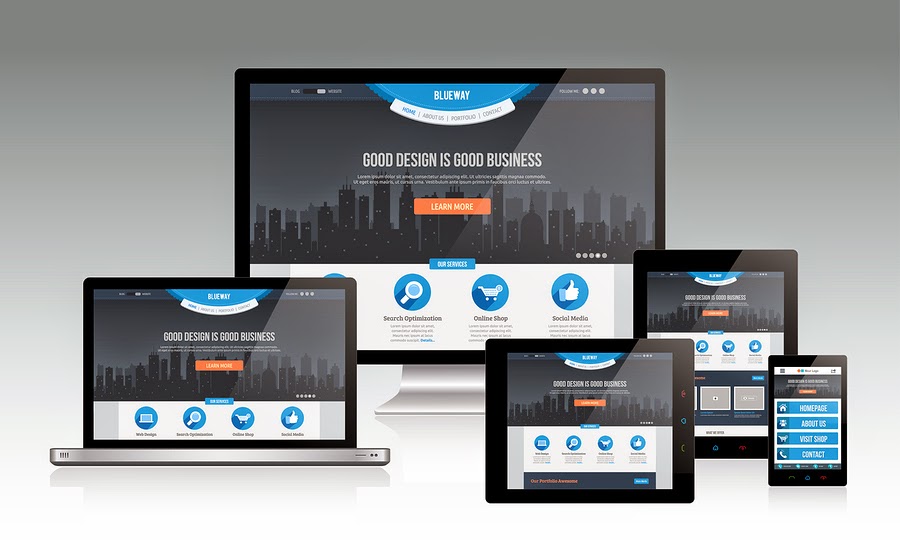
Responsive Website

A proficient and compelling website is the frontal of your online business. Having a website for your business is best method for your users and visitors to find you.  With a website, business owners can generate direct and viral traffic from visitors and customers who want to know more about their products and services. As having a good looking and professional website is necessary for your business, at the same time you need to be sure that your website is responsive too. Responsive web design is the primary source of ultimate success of your online business.

Responsive design: getting it right

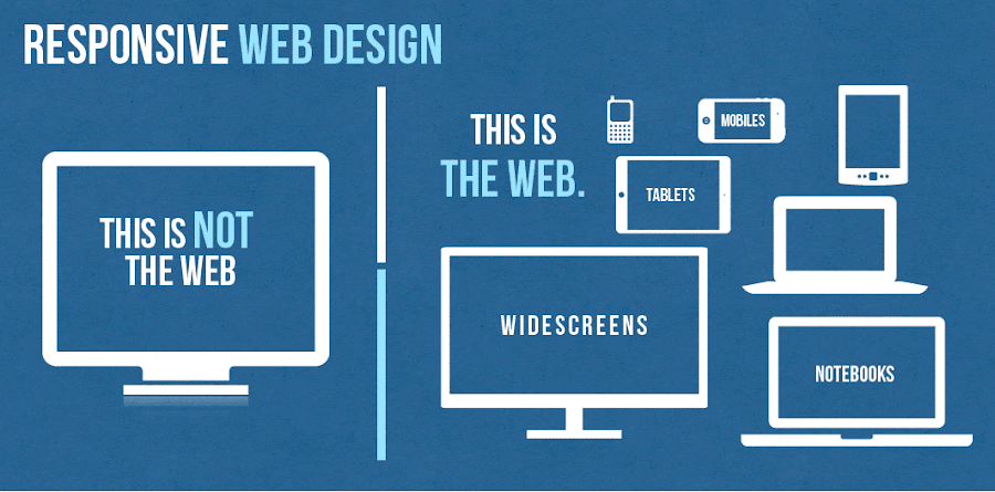
A website with a responsive web design is a website which is visible properly on all kind of mobile devices regardless of its screen size. In today’s tech era, when every day you wake up in the morning, you came to know about the new and latest trend in the web market, it becomes very challenging for every web developers and web designers to stay updated with those trends to survive in IT market with ease. One of the emerging and growing web trend in IT industry is the Responsive web design that is continuously gaining serious attention with the skyrocketing popularity of smartphones and tablets among large number of users especially youngsters and business owners.

In designer’s word, responsive web design is a specific type of web development and design that utilizes CSS3 with fluid proportion-based grids to adapt the layout of a design to viewing environment. Simply put this means that a website designer creates a site or a page that responds to the device a user is viewing the site on. So a user visiting a website on, say, their mobile phone, will see roughly the same website a person viewing from a PC or laptop. That said, more and more designers are changing the layouts so that instead of simply scaling up or down depending on what device you are using, you may see a different site completely from one device to another.

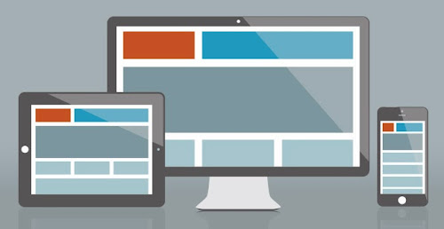
Every web designers and web developers has to take into attention the fact that users can now access internet anywhere and at any time. They are not limited to access internet from monitor or desktop only. So with the speedy and agile change from personal PCs to smartphones and tablets, it has become not only important but also necessary for any website page to resize itself in any screen shape. There has been a lot of buzz about the term ‘Responsive’. Responsive web design allow the visitors to navigate through different section of website from their handheld device with ease. Responsive web design is the concept that will let any website to embrace, resize and fit itself to cater for various screen sizes like desktop, smartphones, tablets etc., and also on the same time making sure that clients and customers can easily navigate your website.

Responsive web design will allow your target visitors to access your service and products you are offering to them from any king of device they have. Therefore we need to provide our users the best means of displaying the information on different screen sizes. Every business owner at the time of analyzing their web traffic will surely understand that about 50 percent of total web traffic to their business comes from small mobile devices. So, it becomes the single most important reason to give your website a responsive layout.

Responsive Web Design Trend

Web design encompasses many different skills and disciplines in the production and maintenance of websites. Areas of web design are graphic design (eg: logo, icons), interface (layout) design, proprietary software.

Click to Enlarge+

Responsive Web Design Trend
Image: InfoBizzs

Why is responsive design so important?

Responsive web design came about as a response to the growing popularity of portable Internet devices like mobile phones and tablets. An already fairly common and growing complaint from users of such devices was the “web’s” inability to adapt properly giving users a less-than favorable experience.

Now thanks to CSS3 and other developments users are able to enjoy their favorite websites and have access to their content on the go as well as at home. Websites are also able to serve their customers content where and when they need it, increasing ad revenue and traffic. In an increasingly mobile world you can expect to see more and more responsive web designs and, eventually, the difference between developing these and regular site will be no different.

Now let’s have a look on the several benefits of Responsive web design for your business.

  1. Drive traffic to your business from all kind of users using desktop, personal computer or any kind of mobile devices. It will increase the total percent of your business traffic by mobile audiences.
  2. Responsive web design for your business allow you to manage the complete website with one set of links which will as a result will increase your website visibility in all major kind of search engines including Google, yahoo and Bing.
  3. Improve in sales and conversion rates of your business — Responsive web design boost conversion rates which is the ultimate requirement of any kind of online business. Responsive Web design is also user and search engine friendly.
  4. Save time and money which is required on mobile website development.
  5. Responsive web design will attract more number of customers to your site and this will take your business to next level of success.

To make the responsive design for your business you need to choose a good and professional web design company that will promise to complete your project on time with reasonable budget.

The anatomy of a responsive site

This infographic features Responsive Web Design Best Practices for both web designers and web developers, including a brief history of responsive web design and some facts/figures on media consumption and mobile usage.

Click to Enlarge+ OR Download as PDF

Responsive Web Design Best Practices
Image: Magic Logix

How To Make a Responsive Website

In this world where the use of mobile devices is outgrowing the use of desktops and laptops most of us need to make sure that our websites and web products work on most mobile devices. That is to say that we need to make our websites responsive. This video is a quick primer on how to make your website responsive.

This video is made by the talented faculty and instructors at Fresh Tilled Soil Labs where they teach and give people the practical hands on design and development core skills and expertise they’ll need in the future.

Why Responsive Website is Necessary?

Responsive Website Design

Responsive design is a website that is designed to ensure that the images, structure and content remain as usual in any device. The design ensures that users get full access to the site when using their phones or tablets smaller screen. This means that a person does not have to worry about having various websites, but to ensure that the sites functions effectively on the mobile device. Majority of the people in the world conduct Google searches on their phones. This means that one can get a good experience regardless of the device sizes and make.

According to Google analytics more that 30% of the website traffic is brought about by tablets and mobile devices. Additionally, 69% of the people that own tablets conduct their shopping on their devices every month. The trend is attracting many people and there is a likely hood that by 2015 web browsing will be conducted on the mobile devices as opposed to desktops.

Responsive design also gives users better and effective experiences. For instance users don’t have to keep zooming the images and the texts on their screens but instead the images in the screen are able to adjust automatically the device’s screen. This ensures that the users can navigate and the site easily. According to research people are likely to move to other websites if the site does not open completely.

However, when a person has a good experience on a specific website with their mobile websites they are likely to use the site effectively to buy products and services from it. An effective user experience further makes communication and feedback to be efficient. It is always important to ensure that the content is accessible in an easy way and it engages the users. A fully responsive website ensures this is achieved by making sure that the users view the site in the best appropriate format for any device being used.

Responsive Web Design

A responsive website is easier to manage and very cost effective when conducting SEO campaigns as you only campaign for one website unlike in a situation where you would have to conduct separate campaigns for the desktop website and the mobile devices. It also ensures that you always stay ahead in the business as many users use mobile devices to search for commodities as well as make purchases. Time is also an important aspect that is saved because there is only one website to update, maintain and market.

This ensures time is saved and money. Responsive design increases the conversion rates, therefore, making the users happy. This is because if a website does not work on the mobile devices the users will not convert. Since a responsive design can easily adapt to any screen the developers have adequate control of all the elements that get displayed on the tablet and the phone. A responsive design also ensures that everything on the website has logical places that help visitors to find what they are looking for easily. In addition it makes sure that the main content on the page is visible without causing any strain. The site is unique and provides a visual sparkle to ensure that the customer enjoys reading the content.

Responsive design also ensures that you can carry out some high end A/B and heat mapping testing. This testing’s can be done easily by the use of software’s such as Optimizely and Clicktale. This ensures that segments user gain good idea of how the users are interacting on the website design services. This makes you to know the marketing strategies and the sales tactic that are effective and the once that are not effective. Responsive design has also been recommended by Google and actually Google prefers the design. The reasons that make Google to prefer responsive design is because it is very efficient for it to craw the site, index and then organize all its contents online.

This is because all websites have only one URL and they share the same HTML on all the devices. However, when a business has both the desktop site and a mobile site it will need to have different URL and different HTML for each. This in return forces Google to index different versions of the exact site. Moreover, Google prefers the responsive design because the content that is in only one URL and website is easier for the users to interact with, link to and share as opposed to content that is on a separate site. Optimizing segments for the mobile devices is very important as it plays a vital role in capturing conversions and visitors. This design is an effective cost effective way of optimizing sites as compared to creating separate sites for tablets, mobile and computer desktops.

Responsive design also plays an important role in helping combat the bounce rate that may be higher. Whether the website is better in search results or not the users are likely to bounce off it does not work efficiently on tablets and the mobiles. Website operators are likely to suffer from high bounce rates if they offer information that varies on their desktops and their mobile devices. A responsive design ensures that this problem is avoided by presenting the same content found on the desktop but in a more advanced functional way. This makes sure that the customers get the information they are looking for and keeps them on the page.

Responsive design websites are the best for users who traverse the internet by the use of their phones and expect to have a smooth desktop experience as well. Going responsive is the best way to ensure that visitors have the best experience on your site as well as make the most of tablet and mobile traffic. While going responsive comes with its challenges on the marketers as well as the website owners it is important to know that the future is on the mobile devices. In case you do not provide a mobiles– friendly environment for your esteemed customers they are likely to move to the competitors that own websites that are easy to operate and manage.

Responsive Web Design

Your website is no longer just viewed on a desktop anymore. It’s out there on a wide range of devices and users on these different devices all have different needs and intentions.

Ryan, from MODassic, showcases their new responsive website and the many advantages of responsive web design and shows how responsive website design can meet the needs of those different users.

Sunday, September 21, 2014

Why You Should Have Interactive Website Design?

Interactive Website Design

Interactivity means the degree of interaction between objects. In web design these objects are a client and a website. The reaction of the visual website elements on the mouse cursor moving can also be called interactivity. For example, have you ever seen a horizontal photo strip that moves right or left depending on your mouse position, or corners of the page that rise up encouraging you to turn it?

With the majority of the websites and applications being interactive, modern web designers are called upon to make a number of considerations which are drastically different from traditional graphic designers. To bridge the gap, designers called upon the discipline of interaction design. Interaction design just like user experience design has evolved to facilitate the interaction between the environment and its people. However, there is a slight difference between user experience and interactive design- interaction designers are typically concerned with the interaction between the users and the computer.

Mobile browsing has been on the increase as more consumers own smart phones and tablets, which offer convenient access to the internet. These devices have doubled the amount of time that people spend accessing the internet. As of 2013, worldwide mobile phone internet user penetration was 73.4 percent. In 2017, figures suggest that more than 90 percent of internet users will access online content through their phones.

Online retail businesses report that a third of their visitors use mobile devices. Mobile browsing has been growing rapidly and this has forced website owners to rethink their design approach. Website owners are shifting toward responsive designs to accommodate mobile browsing. Static designs are no longer effective because online users are looking for interactive websites. There are various reasons why you should have an interactive website design.

Designers Work Hard, So Users Don’t Have To

Designing (and programming, implementing, and especially testing), is a tough job as it requires mastery of a slew of technical skills. Building a super user experience may be quite difficult, and building it correctly may be too difficult for mere words to describe, but — hey — without a positive user experience your users will click away, never to return. Users should not have to spend much time learning a new system, a new lexicon, a new set of patterns and rules and iconographies, just to buy something on the web.

Establish Long-term Relationships

An interactive website design allows you to establish long-term relationships with your online users. Long-term relationships are important for a business. It is easy to sell your products and services to an online user you have engaged with on your site. Interactive designs make it easy to start conversations with potential clients and this helps to develop mutually beneficial relationships.

Wider Reach

Interactivity is one of the most significant attributes of an effective website. An interactive website design allows online visitors to participate. Websites have become more sophisticated over the years and users now expect meaningful interaction with the sites they visit. When a visitor finds what they are looking for on a site, they are more likely to stay longer and visit it frequently. If a site is interactive and offers valuable content, visitors will share the information with their networks on other sites. This is a significant advantage to a business because it gives you a wider reach.

Boost Conversion Rates

When the internet was introduced, online users browsed the web to see other people’s creations. This has changed over the years and users now want to be part of the site. They want to generate content and participate in online communities. There is a shift towards user generated content such as links, music, videos, pictures, and ratings. Online users want to feel like they are part of the website and they are making a valuable contribution. This keeps them coming back to your site and boosts conversion rates.

Better Search Engine Rankings

A mobile friendly website design makes it easy for online visitors to access information from any location. They can use their mobile devices when they are on the move. If your site allows interactivity, you are more likely to get more online visitors and this has a positive impact on your search engine rankings. People tend to visit sites that they find on the search engines. When you integrate some meaningful interactive elements into your website, this helps to excite online users. If people find valuable content on your site and they enjoy navigating through the pages, they will use it for a longer period and even include your link on other sites. You build back links naturally when online users share your links. This increases your popularity and increases your search engine ranking.

Tuesday, September 9, 2014

Syntax Highlighting With Prism

Syntax Highlighting With Prism

UPDATED VERSION: Syntax highlighting with prism.js


Last time I was searching for a good syntax highlighter for beautifully viewing the code snippets on my blog post. Among different syntax highlighter I found out Prism by Lea Verou is pretty awesome.

Yet not sure what I mean by a syntax highlighter or what it does? Here’s an example of JavaScript snippet highlighted with Prism:

<script language="javascript">
  var today= new Date()
</script>
      ....
<body onload=alert(today)>

Prism is a light weight and works on most of all the platform whether it is your own hosted site or any other popular CMS platform like WordPress, Blogger or Tumblr.

Installing on your page

To install Prism on your webpage you need to download the files prism.js and prism.css choosing your desire theme and required settings.

Here, JavaScript file prism.js is your settings and CSS file prism.css is your theme styles.

Now, upload the two files in your hosting site.

Then, you will need to link the prism.css and prism.js files in your index page. Example:

<!DOCTYPE html>
<html>
<head>
 ...
    <link href="themes/prism.css" rel="stylesheet" />
</head>
<body>
 ...
    <!-- after all your content -->
    <script src="prism.js"></script>
</body>
</html>

Remember that to correctly work, prism.css file should be include before the </head> tag and prism.js before </body> tag.

Installing on WordPress

Easily highlight your code on WordPress with WP PrismJS. Simply download & activate the plugin and a new icon on your TinyMCE editor will appear. Click on it and you will be able to enter your indented code; choose the language; specifying the maximum height of the code window and the filename.

Installing on Blogger/Tumblr

To install Prism on your Blogger/Tumblr blog you need to upload prism.css and prism.js files in other file hosting sites like Google Drive or Dropbox because we cannot host file in the Blogger/Tumblr site. Then as same process above go to template edit and inculde prism.css file link before the </head> tag and prism.js file link before </body> tag.

Remember that hosting your file on other site like Google Drive you should set the file for public view and need to link direct link like http://googledrive.com/host/YOUR_FILE_ID/. Public viewing link and direct link may vary according to the different sites.

If you don’t like to upload the file and want to use Prism default theme then you can include the following two files link to install Prism:

<link href="http://prismjs.com/themes/prism.css" rel="stylesheet" />
<script src="http://prismjs.com/prism.js"></script>

Using Prism

First thing you have to escape HTML character < to &lt; and > to &gt; to highlight syntax with Prism. For Example:

&lt;pre&gt;
&lt;code class="language-javascript"&gt;
&lt;script&gt;
        var today= new Date()
  &lt;/script&gt;
          ....
  &lt;body onload=alert(today)&gt;
&lt;/code&gt;
&lt;/pre&gt;

You can use tools like QuickEscape tool to escape HTML character.

Then,

You have to wrap your code inside the <pre> and the <code> tag defining the necessary class="language-XXX".

For example to show HTML snippet define class="language-markup"

&lt;pre&gt;
&lt;code class="language-markup"&gt;
  <--! YOUR HTML CODE HERE -->
&lt;pre&gt;
&lt;/code&gt;

For CSS snippet define class="language-css"

&lt;pre&gt;
&lt;code class="language-css"&gt;
    /* YOUR CSS CODE HERE */
&lt;pre&gt;
&lt;/code&gt;

For JavaScript snippet define class="language-javascript"

&lt;pre&gt;
&lt;code class="language-javascript"&gt;
  // YOUR JAVASCRIPT CODE HERE
&lt;pre&gt;
&lt;/code&gt;

With Prism by help of these few easy steps you get a nice highlighted code snippet, isn’t it awesome?

Tuesday, March 4, 2014

HTML5 & CSS3 Cheat Sheet

HTML5 & CSS3 Cheat Sheet

On the journey to learn coding for web development lots of changes happened. Developing New version of HTML5 and CSS3 is one of them. But back then those version were not completed neither accepted by major web browsers. Now things have changed and HTML5 and CSS3 accepted by all web browsers and versions and we all know that now using HTML is much more easy with lots of option.

This is HTML5 and CSS3 cheat sheet for those who want to work with this latest script. This cheat sheet include a relative comparison between last version and new version of HTML5 and CSS3.

This is made by CodeSchool which might cost you 25$. But you are getting it for free.

HTML5 Cheat Sheet

New HTML5 tags with descriptions. Comparison between old version of HTML and HTML5.

HTML5 Cheat Sheet-2

Complete HTML5 tags updated version for your to easily memorize and use...

HTML5 Cheat Sheet

CSS3 Cheat Sheet

New CSS3 Attributes with great examples and very easy to memorize.

CSS3 Cheat Sheet

Download In PDF Format

Creative Common Courtesy from codeschool.com & bestechblog.com

Saturday, February 22, 2014

Create Impressive Website Design with CSS3

Create Impressive Website Design with CSS3

Getting creative with CSS3

CSS3 is used in organizing the style and layout of Web pages. It is the latest standard in the CSS series. CSS3 offers a wide variety of new trends to make an impact with your web designs. With many exciting new functions and features, CSS can be used as a powerful tool in website designing and development. A CSS3 refers to the technical stipulation of a layout. It ensures that a web page will appear precisely the way the website developer has specified.

As a website designer we have to look into the capabilities of CSS3 and need to make the most of it. The basic approach of CSS3 in web designing is to make the web page user friendly by removing loads of complications from it. The changes that CSS3 has brought into the website development market are quite amazing. Using CSS3 can speed up the process of website design and development and also speed up your web site.

Using CSS3 to your Advantage

Keep all the things side apart, here are some advantages of CSS3 for you:

1. Better search engine results:

With CSS3, you can keep your HTML code much cleaner which in turn helps search engine crawler in getting the real content from your site very easily. You can also put any content anywhere in your web page and no longer each individual page have to be simplified to replicate the new style. By using this website design technique you will make much greater consistency throughout the site easily.

2. Lightweight coding:

In the field of website development, no one likes to wait for anything to come. This condition also applies in loading of web pages. When a website page takes a lot of time to load, generally users leave that page. By using CSS3, web pages can be made lighter which will allow the site to load faster. As table layout format is not used in CSS3, the sites acquire less memory and load faster.

3. Accessibility and usability:

In website designing you have to make it understandable that the content of the site must be validated in all formats of the browsers. A web designer has better control over a website by using CSS3. CSS3 allows for more compatible style elements, including font size and line heights through which web pages can be used more easily by people with disabilities. Website developers can craft specific CSS files especially for printing, or mobile devices, as well as the customary computer screen and in doing so making websites fully multimedia applications.

4. Isolation and Differentiation:

With the introduction of the CSS3 format, website designers have a lot to offer in development of a web page. CSS3 allows changes and modifications to be made in individual modules. CSS3 format helps users in separating presentation from structures. In this technique, style sheets defined presentational characteristics whereas the document structures were defined in separate heading. This eases the maintenance of the web page in efficient and comfortable manner.

When you start styling your content with CSS3 modules, you will probably never want to go back to using the old tags for styling.

You must use CSS3 to determine its full potential. Flexibility is the most useful features of using Cascading Style Sheets. One of the important things you require to gaze at before using this technique is what browsers the greater part of your users uses to visit your website. The reason behind this question is that it sometimes may be very difficult to make your CSS sprites friendly with many of the browsers depending on the techniques you use.

HTML5 And CSS3 To Change Trends Of Designing

HTML5 And CSS3 To Change Trends Of Designing

The clamoring demand of websites is increasing day by day and this is the reason that business entrepreneurs want their websites to perform equally better as their business and much better than their business development executives. And keeping pace with the demand, designers have started believing that HTML 4 and CSS early version needs a replacement. With newer versions on the forefront, HTML and CSS are all set to break grounds in the Internet world. The hair-raising amalgamation of two web languages HTML 5 and CSS 3 are expected to be seen on the websites in the times to come. Before we move a bit further, let’s first discuss what HTML 5 and CSS 3 is?

HTML 5 and its features:

HTML is an acronym of Hyper Text Markup Language that is utilized by web designers to create web pages that they wish to develop. Typically, what is portrayed under HTML coding is the content of the website that encompasses title, headings,and other content. But replacing the old version, HTML 4, HTML 5 has brought something new for the designers and absolutely for the users. In contrast to what websites were few decades ago, today we can see a radical change. With business seeking out for user–friendly, media rich and interactive websites, HTML 4 has taken a back seat and HTML 5 is ready to create furore among designers. HTML 5 being a new version of the language provides coding that will certainly allow easy, better and quick fusion of videos and audios. A new advanced interface for the users is again an addition that can be expected out of this advanced version.

CSS 3 and its forthcoming advancements:

Known as Cascading Style Sheets, CSS is primarily associated with the presentation of the content on the website when visited by a web crawler. It focuses on the background, font, style, color and the overall look of the website. With other advancements in comparison to what it was in late 90’s, CSS 2 is now replaced with CSS 3 which was working well for the website of previous times. However, with the limitation of second version to particular styles, effects, fonts, CSS3 is brought to the effect. Keeping in mind the appeal and interactiveness of the websites, CSS3 is set to bring revolution. This new version is made to provide the designers with more effective tools that makes the website more appealing visually.

Benefits of using HTML5 and CSS3:

  1. Better quality of visuals is the chief benefit of using both together.
  2. Helps adding customized touch to the fonts.
  3. Assists in enhancing table look through better styles.
  4. Due to the web sockets available, quick transfer of online data and communication is done.
  5. Native functionality of HTML 5 and CSS 3 doesn't involve the need of validation.
  6. Ensures better information access.
  7. Allows incorporating Canvas over the website.

Thus website designing with the use of HTML5 and CSS3 provides accessibility to the designers to use plugins relating to audio, video and thus interactiveness. With the aforementioned benefits of using HTML and CSS newer versions, designers can create furore in the designing industry.

Wednesday, January 29, 2014

What Are The Basics Of Web Design?

What Are The Basics Of Web Design?

By Pol Thomas

Web design uses almost all those elements as used in print design. One requires exploring layout and space, manage colours and fonts, and arrange it all together in a format in order to put all the intended messages across. Those resources will enable one know details of web design even if one is a professional web developer or just on one’s beginning stage leading to the web arena.

Understanding of Designing Elements:

One must know that a good web design is equivalent to the good design. If anyone has the right understanding about the elements that appropriately suits with a good design, then one will undoubtedly have a Web page that works well. One applies those elements of good design if and when one is producing a web page, a business card, or a raiment logo, and once one makes out them and their necessities and differences, one will acquire the skills and expertise that requires for becoming a great web designer.

Use of Colours:

Colour is present everywhere. With it we make our world up and help ourselves see things from different angles. In short, it is what as we see the things around us and as we dress up our world. The “red” or the “black” is not mere colour; they have meaning beyond their apparent looks. And they have larger important effects on design elements. The pools of colours show influences in their varieties as how they could be used effectively in web designing services.

Application of Web design software:

“What You See Is What You Get” [WYSIWYG] editor is a popular preference among most of the web designers. It has become popular because this editor provides a visual interface to the design effects. At the same time, it should be remembered there are more opportunities and resources than they meet the eyes. Only web editor could not have brought about such a revolution unless there have been other designing tools.

Fundamentals of Web Layouts:

Layout comes at the very onset of web designing services. It is the proper arrangement of elements on web pages. It is very necessary to begin with basic design rules. If and when one understands them, one can proceed across how to place elements on one’s web pages.

Usefulness of Images & Graphics:

If one wants to apply and bring about an environment of fun and frolic, the graphics and their use will be best considered. The effects of graphics are so long extensive that it reminds us of the proverb “a picture is worth one thousand words”. This proverb is also applicable to the web designing service and their uses of images and graphics.

Usefulness of Navigation Interfaces:

When a website is live on the internet, there are all chances that visitors may come to the web pages of the website. On visiting the website, visitors may want to know what the purpose of the website is. And for this reason, they may go to one page to another. This is called navigation. There should be all browser compatible navigation interfaces, where from the visitors can move through one page to another and see the objectives of the website as a whole and at the same time see the image and graphic application.

The purpose of a website design is well fulfilled only if the website is professionally designed and in this case professional web designing tops the list of priorities. Only a professionally designed website can bring in desired business and return on investment on a quicker pace.

About The Author
The author has long been in the field of website designing. His experience and expertise are really worth following.

Image: Mighty 8th Media

Friday, January 17, 2014

12 Web Design Tips You Need To Know!

12 Web Design Tips You Need To Know!

1: The user needs to know what your site is about in seconds

If a visitor can’t work out what your site is about in a couple of seconds, they will probably end up just going somewhere else.

2: Use fonts that are easy on the eyes

Some fonts will give an edgy and avant garde appearance to your website. However a websites main objective is usually to deliver a message and communicate to targeted visitors that will either enjoy the content or the service you are providing them. In this case, ‘alternative’ fonts should definitely be avoided.

3: Do not overuse Flash

Flash does not only significantly decrease your ability to appear in Search engines but also increases the load time of your website. If your user can’t access your content quickly and easily. They will start to look somewhere else.

4: If music MUST be played, allow the user to start it

Some scenarios such as delivering a speech to the user or a guided tour might need audio element. We strongly advise that you make sure the user is in control, let them control the ‘Play’ button as opposed to bombarding them with audio as soon as they enter.

5: Always include contact details

When a user is on your website, there is a good chance they have had some thought of contacting you in some way. Your website is available 24 hours a day, 7 days a week and it is therefore vital for this information to be on your website and in easy reach of the user.

6: Avoid complex URL structures

Simple, easy to understand, keyword-based URL structure improve your search engine rankings and make it easier for the user to identify the content of your pages before even visiting them.

7: Avoid horizontal scrolling

Vertical scrolling is tolerable, however the same can not be said about horizontal scrolling. The most used screen resolution nowadays is 1024 x 768 pixels, so make sure that your website fits inside it.

8: Embedded search ability

Search engines revolutionized the Internet for a reason. They make it very easy to find the information we are looking for. Make sure you include an easy to use search bar on your site.

9: Do not hide advertising inside the content

Your website should be about the content, not about the amount of revenue you can generate from people clicking on adverts. Blending advertising like Adsense units or affiliate links inside your content will simply take the user away from your website and the service or product you desire for them to buy.

10: Include anchor text on links

Having anchor text on your links will ensure the reader knows where they are going upon clicking the link. It also has the SEO benefit of more external links to where it is pointing to.

11: No spelling or grammatical mistakes

Despite not being as obvious this is one of the most important factors affecting the overall quality of a website. Incorrect spelling will only end up damaging your online reputation.

12: Avoid using harsh colors

If the user has to take 2 paracetamols every time they visit your site, you need to choose a different colour scheme. Endeavour to deliver a mood and let the user focus on the content.

About the Author
Aiden Nichols, a Digital Marketing Specialist, Website Developer and Project Manager with substantial core marketing experience in a wide variety of online business applications. Particularly interested in Search Engine Optimisation and Pay-Per-Click Management. Always interested developing high traffic websites and close interaction with clients.

Creative thinking combined with exceptional digital marketing strategy have driven my desire to delivering successful, impactful and efficient digital marketing strategies that focus on providing a positive ROI.

Flexibility to adapt to changing environments, an ability to work well under pressure to meet tight and changing deadlines, strong interpersonal and team management skills, a real ‘can do’ attitude plus meticulous attention to detail adds to an impressive list of professional traits.

Image: Kreative Kicks