Milan Aryal's Latest Posts

Monday, September 22, 2014

The Anatomy of a Successful Responsive Website

Responsive Website

A proficient and compelling website is the frontal of your online business. Having a website for your business is best method for your users and visitors to find you.  With a website, business owners can generate direct and viral traffic from visitors and customers who want to know more about their products and services. As having a good looking and professional website is necessary for your business, at the same time you need to be sure that your website is responsive too. Responsive web design is the primary source of ultimate success of your online business.

Responsive design: getting it right

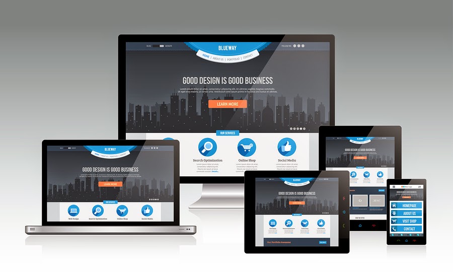
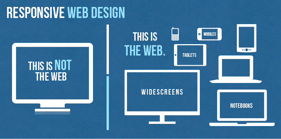
A website with a responsive web design is a website which is visible properly on all kind of mobile devices regardless of its screen size. In today’s tech era, when every day you wake up in the morning, you came to know about the new and latest trend in the web market, it becomes very challenging for every web developers and web designers to stay updated with those trends to survive in IT market with ease. One of the emerging and growing web trend in IT industry is the Responsive web design that is continuously gaining serious attention with the skyrocketing popularity of smartphones and tablets among large number of users especially youngsters and business owners.

In designer’s word, responsive web design is a specific type of web development and design that utilizes CSS3 with fluid proportion-based grids to adapt the layout of a design to viewing environment. Simply put this means that a website designer creates a site or a page that responds to the device a user is viewing the site on. So a user visiting a website on, say, their mobile phone, will see roughly the same website a person viewing from a PC or laptop. That said, more and more designers are changing the layouts so that instead of simply scaling up or down depending on what device you are using, you may see a different site completely from one device to another.

Every web designers and web developers has to take into attention the fact that users can now access internet anywhere and at any time. They are not limited to access internet from monitor or desktop only. So with the speedy and agile change from personal PCs to smartphones and tablets, it has become not only important but also necessary for any website page to resize itself in any screen shape. There has been a lot of buzz about the term ‘Responsive’. Responsive web design allow the visitors to navigate through different section of website from their handheld device with ease. Responsive web design is the concept that will let any website to embrace, resize and fit itself to cater for various screen sizes like desktop, smartphones, tablets etc., and also on the same time making sure that clients and customers can easily navigate your website.

Responsive web design will allow your target visitors to access your service and products you are offering to them from any king of device they have. Therefore we need to provide our users the best means of displaying the information on different screen sizes. Every business owner at the time of analyzing their web traffic will surely understand that about 50 percent of total web traffic to their business comes from small mobile devices. So, it becomes the single most important reason to give your website a responsive layout.

Responsive Web Design Trend

Web design encompasses many different skills and disciplines in the production and maintenance of websites. Areas of web design are graphic design (eg: logo, icons), interface (layout) design, proprietary software.

Click to Enlarge+

Responsive Web Design Trend
Image: InfoBizzs

Why is responsive design so important?

Responsive web design came about as a response to the growing popularity of portable Internet devices like mobile phones and tablets. An already fairly common and growing complaint from users of such devices was the “web’s” inability to adapt properly giving users a less-than favorable experience.

Now thanks to CSS3 and other developments users are able to enjoy their favorite websites and have access to their content on the go as well as at home. Websites are also able to serve their customers content where and when they need it, increasing ad revenue and traffic. In an increasingly mobile world you can expect to see more and more responsive web designs and, eventually, the difference between developing these and regular site will be no different.

Now let’s have a look on the several benefits of Responsive web design for your business.

  1. Drive traffic to your business from all kind of users using desktop, personal computer or any kind of mobile devices. It will increase the total percent of your business traffic by mobile audiences.
  2. Responsive web design for your business allow you to manage the complete website with one set of links which will as a result will increase your website visibility in all major kind of search engines including Google, yahoo and Bing.
  3. Improve in sales and conversion rates of your business — Responsive web design boost conversion rates which is the ultimate requirement of any kind of online business. Responsive Web design is also user and search engine friendly.
  4. Save time and money which is required on mobile website development.
  5. Responsive web design will attract more number of customers to your site and this will take your business to next level of success.

To make the responsive design for your business you need to choose a good and professional web design company that will promise to complete your project on time with reasonable budget.

The anatomy of a responsive site

This infographic features Responsive Web Design Best Practices for both web designers and web developers, including a brief history of responsive web design and some facts/figures on media consumption and mobile usage.

Click to Enlarge+ OR Download as PDF

Responsive Web Design Best Practices
Image: Magic Logix

How To Make a Responsive Website

In this world where the use of mobile devices is outgrowing the use of desktops and laptops most of us need to make sure that our websites and web products work on most mobile devices. That is to say that we need to make our websites responsive. This video is a quick primer on how to make your website responsive.

This video is made by the talented faculty and instructors at Fresh Tilled Soil Labs where they teach and give people the practical hands on design and development core skills and expertise they’ll need in the future.

Why Responsive Website is Necessary?

Responsive Website Design

Responsive design is a website that is designed to ensure that the images, structure and content remain as usual in any device. The design ensures that users get full access to the site when using their phones or tablets smaller screen. This means that a person does not have to worry about having various websites, but to ensure that the sites functions effectively on the mobile device. Majority of the people in the world conduct Google searches on their phones. This means that one can get a good experience regardless of the device sizes and make.

According to Google analytics more that 30% of the website traffic is brought about by tablets and mobile devices. Additionally, 69% of the people that own tablets conduct their shopping on their devices every month. The trend is attracting many people and there is a likely hood that by 2015 web browsing will be conducted on the mobile devices as opposed to desktops.

Responsive design also gives users better and effective experiences. For instance users don’t have to keep zooming the images and the texts on their screens but instead the images in the screen are able to adjust automatically the device’s screen. This ensures that the users can navigate and the site easily. According to research people are likely to move to other websites if the site does not open completely.

However, when a person has a good experience on a specific website with their mobile websites they are likely to use the site effectively to buy products and services from it. An effective user experience further makes communication and feedback to be efficient. It is always important to ensure that the content is accessible in an easy way and it engages the users. A fully responsive website ensures this is achieved by making sure that the users view the site in the best appropriate format for any device being used.

Responsive Web Design

A responsive website is easier to manage and very cost effective when conducting SEO campaigns as you only campaign for one website unlike in a situation where you would have to conduct separate campaigns for the desktop website and the mobile devices. It also ensures that you always stay ahead in the business as many users use mobile devices to search for commodities as well as make purchases. Time is also an important aspect that is saved because there is only one website to update, maintain and market.

This ensures time is saved and money. Responsive design increases the conversion rates, therefore, making the users happy. This is because if a website does not work on the mobile devices the users will not convert. Since a responsive design can easily adapt to any screen the developers have adequate control of all the elements that get displayed on the tablet and the phone. A responsive design also ensures that everything on the website has logical places that help visitors to find what they are looking for easily. In addition it makes sure that the main content on the page is visible without causing any strain. The site is unique and provides a visual sparkle to ensure that the customer enjoys reading the content.

Responsive design also ensures that you can carry out some high end A/B and heat mapping testing. This testing’s can be done easily by the use of software’s such as Optimizely and Clicktale. This ensures that segments user gain good idea of how the users are interacting on the website design services. This makes you to know the marketing strategies and the sales tactic that are effective and the once that are not effective. Responsive design has also been recommended by Google and actually Google prefers the design. The reasons that make Google to prefer responsive design is because it is very efficient for it to craw the site, index and then organize all its contents online.

This is because all websites have only one URL and they share the same HTML on all the devices. However, when a business has both the desktop site and a mobile site it will need to have different URL and different HTML for each. This in return forces Google to index different versions of the exact site. Moreover, Google prefers the responsive design because the content that is in only one URL and website is easier for the users to interact with, link to and share as opposed to content that is on a separate site. Optimizing segments for the mobile devices is very important as it plays a vital role in capturing conversions and visitors. This design is an effective cost effective way of optimizing sites as compared to creating separate sites for tablets, mobile and computer desktops.

Responsive design also plays an important role in helping combat the bounce rate that may be higher. Whether the website is better in search results or not the users are likely to bounce off it does not work efficiently on tablets and the mobiles. Website operators are likely to suffer from high bounce rates if they offer information that varies on their desktops and their mobile devices. A responsive design ensures that this problem is avoided by presenting the same content found on the desktop but in a more advanced functional way. This makes sure that the customers get the information they are looking for and keeps them on the page.

Responsive design websites are the best for users who traverse the internet by the use of their phones and expect to have a smooth desktop experience as well. Going responsive is the best way to ensure that visitors have the best experience on your site as well as make the most of tablet and mobile traffic. While going responsive comes with its challenges on the marketers as well as the website owners it is important to know that the future is on the mobile devices. In case you do not provide a mobiles– friendly environment for your esteemed customers they are likely to move to the competitors that own websites that are easy to operate and manage.

Responsive Web Design

Your website is no longer just viewed on a desktop anymore. It’s out there on a wide range of devices and users on these different devices all have different needs and intentions.

Ryan, from MODassic, showcases their new responsive website and the many advantages of responsive web design and shows how responsive website design can meet the needs of those different users.

Sunday, September 21, 2014

Why You Should Have Interactive Website Design?

Interactive Website Design

Interactivity means the degree of interaction between objects. In web design these objects are a client and a website. The reaction of the visual website elements on the mouse cursor moving can also be called interactivity. For example, have you ever seen a horizontal photo strip that moves right or left depending on your mouse position, or corners of the page that rise up encouraging you to turn it?

With the majority of the websites and applications being interactive, modern web designers are called upon to make a number of considerations which are drastically different from traditional graphic designers. To bridge the gap, designers called upon the discipline of interaction design. Interaction design just like user experience design has evolved to facilitate the interaction between the environment and its people. However, there is a slight difference between user experience and interactive design- interaction designers are typically concerned with the interaction between the users and the computer.

Mobile browsing has been on the increase as more consumers own smart phones and tablets, which offer convenient access to the internet. These devices have doubled the amount of time that people spend accessing the internet. As of 2013, worldwide mobile phone internet user penetration was 73.4 percent. In 2017, figures suggest that more than 90 percent of internet users will access online content through their phones.

Online retail businesses report that a third of their visitors use mobile devices. Mobile browsing has been growing rapidly and this has forced website owners to rethink their design approach. Website owners are shifting toward responsive designs to accommodate mobile browsing. Static designs are no longer effective because online users are looking for interactive websites. There are various reasons why you should have an interactive website design.

Designers Work Hard, So Users Don’t Have To

Designing (and programming, implementing, and especially testing), is a tough job as it requires mastery of a slew of technical skills. Building a super user experience may be quite difficult, and building it correctly may be too difficult for mere words to describe, but — hey — without a positive user experience your users will click away, never to return. Users should not have to spend much time learning a new system, a new lexicon, a new set of patterns and rules and iconographies, just to buy something on the web.

Establish Long-term Relationships

An interactive website design allows you to establish long-term relationships with your online users. Long-term relationships are important for a business. It is easy to sell your products and services to an online user you have engaged with on your site. Interactive designs make it easy to start conversations with potential clients and this helps to develop mutually beneficial relationships.

Wider Reach

Interactivity is one of the most significant attributes of an effective website. An interactive website design allows online visitors to participate. Websites have become more sophisticated over the years and users now expect meaningful interaction with the sites they visit. When a visitor finds what they are looking for on a site, they are more likely to stay longer and visit it frequently. If a site is interactive and offers valuable content, visitors will share the information with their networks on other sites. This is a significant advantage to a business because it gives you a wider reach.

Boost Conversion Rates

When the internet was introduced, online users browsed the web to see other people’s creations. This has changed over the years and users now want to be part of the site. They want to generate content and participate in online communities. There is a shift towards user generated content such as links, music, videos, pictures, and ratings. Online users want to feel like they are part of the website and they are making a valuable contribution. This keeps them coming back to your site and boosts conversion rates.

Better Search Engine Rankings

A mobile friendly website design makes it easy for online visitors to access information from any location. They can use their mobile devices when they are on the move. If your site allows interactivity, you are more likely to get more online visitors and this has a positive impact on your search engine rankings. People tend to visit sites that they find on the search engines. When you integrate some meaningful interactive elements into your website, this helps to excite online users. If people find valuable content on your site and they enjoy navigating through the pages, they will use it for a longer period and even include your link on other sites. You build back links naturally when online users share your links. This increases your popularity and increases your search engine ranking.

Friday, September 12, 2014

The Elements of a Creative Logo Design

The Elements of a Creative Logo Design

Any business logo design will be the visual reflection of its brand. Basically, it’s a graphical representation to show the particular selection of activities that will incorporate your opinion in the minds of your customers whilst coming across the organization. If a company is at its starting phase, the logo will highlight the types of products and services a customer should be expecting from them.

A variety of factors help with the efficiency required for your logo design, including, design, formats, and color. However today let’s talk over some definitely key elements affecting logo design of your brand.

Logo Dimension

Logo designs generally go on a two-dimensional type but a majority of logos merely pleads to be developed in three-dimensions. A two-dimensional logo makes up involving color, design, contrast, and so forth; the three-dimensional could rather be seen as sophisticated plus unexpected.

Logo Design Tips for Dummies: What your Logo Should be?

Here are the 6 qualities that every good logo should possess...

Logo Design Tips for Dummies: What your Logo Should be?
Image: Designmantic

Contrast

The design of a logo is not effective unless of course it incorporates outstanding contrast amongst a variety of factors including picture and text size, distinct colors and fonts, etc. It’s a no doubt a strong tool to design a defined and state of the art piece of work. Other than scale and color, increasing or decreasing backlighting, translucency, consistency and interaction can also create contrast in a logo.

Color Emotion Guide

Scientists have been studying the way we react to colors for many years. Certain colors make us feel a certain way about something. As long as the designer knows what these colors and emotions are, the designer can use that information to help present the business in the right way. These are not hard and fast rules but smart designers use the information to their clients advantage.

This fun infographic lays out the emotions and qualities that well known brands like to be known for. The color psychology is only one part of the puzzle but I think you will agree it is a very important part of it. The Logo Company put together this amazing graphic on the color emotion guide and it is fantastic!

Color Emotion Guide
Image: The Logo Company

Icons

Creative Logo designers generally apply the concept of symbology provide a feeling of belonging. By using it continuously, your consumers will start to see your brand name in the reflection of symbols used in the logo. It will position your brand well in the customer’s mind and they will be able to recall it increasingly.  Accumulation of constantly applied designs can serve as a familiar plus unique brand’s artwork expressions. This can be an incontrovertible fact that brands which has been doing great to create a sense belonging are related to buying develop the maximum value above time.

7 Deadly Sins of Logo Design

Ever wondered what you should not be doing to your brand’s logo? Here are the 7 big no-nos of logo design that are a MUST to avoid...

7 Deadly Sins of Logo Design
Image: Designmantic

Typography

Typography used in a graphical representation in all kinds, types and appearance are embedded with amazing features among all of them. This contributes to develop grace when used in advertising as this feature favor some logos and people who consider it a pain have never come out from the old age trend of using Times New Roman. When you require a straightforward, and clean mark, go for the typeface which suits your organization the best. It should go with the company or brand image; otherwise it would be a disaster.

7 Deadly Sins of Typography

Study the infographic that follows and seek refuge from these 7 deadly sins in the name of all that is pure and holy! All be warned!

7 Deadly Sins of Typography
Image: Designmantic

Customization

In the current fast-paced world, customization is now a fundamental portion of virtually any intellectual and creative venture. Throughout the year a company is involved in denoting brand name individuality, and this idea remains to be while on an experimental level. Brand names usually are repairing their own logo designs to evolve to the new idea. Various brands using the same logo tend to personalize it in their own way to stand out from other house of brands. A logo design can be customized by means of symbology or color depending on the requirement of each brand. It feels like a latest concept surfing in the design market, plus terrifying the old ones using the same logo for all brands.

A Successful Logo Design Is…

An infographic outlining the most important elements of a successful logo design. Memorable, Adaptable, Social & Descriptive

A Successful Logo Design Is…
Image: Boutique By Design

Tuesday, September 9, 2014

Syntax Highlighting With Prism

Syntax Highlighting With Prism

UPDATED VERSION: Syntax highlighting with prism.js


Last time I was searching for a good syntax highlighter for beautifully viewing the code snippets on my blog post. Among different syntax highlighter I found out Prism by Lea Verou is pretty awesome.

Yet not sure what I mean by a syntax highlighter or what it does? Here’s an example of JavaScript snippet highlighted with Prism:

<script language="javascript">
  var today= new Date()
</script>
      ....
<body onload=alert(today)>

Prism is a light weight and works on most of all the platform whether it is your own hosted site or any other popular CMS platform like WordPress, Blogger or Tumblr.

Installing on your page

To install Prism on your webpage you need to download the files prism.js and prism.css choosing your desire theme and required settings.

Here, JavaScript file prism.js is your settings and CSS file prism.css is your theme styles.

Now, upload the two files in your hosting site.

Then, you will need to link the prism.css and prism.js files in your index page. Example:

<!DOCTYPE html>
<html>
<head>
 ...
    <link href="themes/prism.css" rel="stylesheet" />
</head>
<body>
 ...
    <!-- after all your content -->
    <script src="prism.js"></script>
</body>
</html>

Remember that to correctly work, prism.css file should be include before the </head> tag and prism.js before </body> tag.

Installing on WordPress

Easily highlight your code on WordPress with WP PrismJS. Simply download & activate the plugin and a new icon on your TinyMCE editor will appear. Click on it and you will be able to enter your indented code; choose the language; specifying the maximum height of the code window and the filename.

Installing on Blogger/Tumblr

To install Prism on your Blogger/Tumblr blog you need to upload prism.css and prism.js files in other file hosting sites like Google Drive or Dropbox because we cannot host file in the Blogger/Tumblr site. Then as same process above go to template edit and inculde prism.css file link before the </head> tag and prism.js file link before </body> tag.

Remember that hosting your file on other site like Google Drive you should set the file for public view and need to link direct link like http://googledrive.com/host/YOUR_FILE_ID/. Public viewing link and direct link may vary according to the different sites.

If you don’t like to upload the file and want to use Prism default theme then you can include the following two files link to install Prism:

<link href="http://prismjs.com/themes/prism.css" rel="stylesheet" />
<script src="http://prismjs.com/prism.js"></script>

Using Prism

First thing you have to escape HTML character < to &lt; and > to &gt; to highlight syntax with Prism. For Example:

&lt;pre&gt;
&lt;code class="language-javascript"&gt;
&lt;script&gt;
        var today= new Date()
  &lt;/script&gt;
          ....
  &lt;body onload=alert(today)&gt;
&lt;/code&gt;
&lt;/pre&gt;

You can use tools like QuickEscape tool to escape HTML character.

Then,

You have to wrap your code inside the <pre> and the <code> tag defining the necessary class="language-XXX".

For example to show HTML snippet define class="language-markup"

&lt;pre&gt;
&lt;code class="language-markup"&gt;
  <--! YOUR HTML CODE HERE -->
&lt;pre&gt;
&lt;/code&gt;

For CSS snippet define class="language-css"

&lt;pre&gt;
&lt;code class="language-css"&gt;
    /* YOUR CSS CODE HERE */
&lt;pre&gt;
&lt;/code&gt;

For JavaScript snippet define class="language-javascript"

&lt;pre&gt;
&lt;code class="language-javascript"&gt;
  // YOUR JAVASCRIPT CODE HERE
&lt;pre&gt;
&lt;/code&gt;

With Prism by help of these few easy steps you get a nice highlighted code snippet, isn’t it awesome?

Saturday, September 6, 2014

The Essential Elements of Graphic Design

The Essential Elements of Graphic Design

In the world graphic design has become one of the most important things. This is because it is very key in printing and web designing. Graphic design can be used in number of ways for  product/service promotion, such as posters, banners, newsletters, logos, brochures, flyers, business cards, office stationery such as cash sale  etc.

In order to come up with a well paying design one should consider facts and follow them. These points are related to colors, layout, texture and the size of the designing format.

Layout:

The layout is the most important part of the graphic design for it is the basis upon which all the other details are added. A good layout should be well balanced, neat  and put in a way that the reader will be able to read with ease. One is supposed to put the text in its appropriate position in order to make it nice.

Color:

One is supposed to come up with the appropriate corporate color in which it should not be very repetitive. The colors to be used are either in the background, the texts and also the objects. Things such as banner should be legible from a far since it is used to advertise, promote or talk of an event. Being placed at a strategic position it should be read with ease by all the passers by, Newsletter on the other hand should be arranged in a way that the reader will be able to read with ease. Appropriate colors should be used for different texts to make the page attractive to the reader. While on the logo should be designed in a way that they will be understood with ease and should communicate. It should not have many color for it will look bulky.

The 10 Commandments of Color Theory

Here come the 10 cardinal rules of color scheming to help you save time when choosing colors. These essentials serve as bedrock to the color-verse.

Click to Enlarge+

The 10 Commandments of Color Theory
Image: Designmantic

Texture:

Two thing one is supposed to consider in the texture is the way the text will look like and on what type of the paper the text will lie. It is in this that the designer will be able to explain to the client the texture of the design. The  texture therefore can entail background where it should be simple with the color which is upto the event. The way also the text and the background ought to look on the material should be attractive to the reader. Take for instance a banner where by the background color and the image colors should not contrast.

Size:

Size is also another thing to consider most when coming up with the design. It is where size of the entire layout is shown and also the size of the text should vary with the size of the entire layout. The size of the text differs with the entire size of the design. The font size and the size of the layout should be well balanced considering the header and bodice.

Font:

The font describes the company or corporate. Some of the companies have a specific font and font colour which should not be changed. One should be careful when selecting the font of the text or the header as well as in the logo.

The 10 Commandments of Typography

The infographic below illustrates the 10 cardinal rules that could be followed as quite the basics when it comes to selecting fonts.

Click to Enlarge+

The 10 Commandments of Typography
Image: Designmantic

Bonus: The 10 Commandments of Logo Design

This visual below offers a holistic snapshot of the basic principles of logo design with the help of applied examples to make things easy peasy to grasp!

Click to Enlarge+

The 10 Commandments of Logo Design
Image: Designmantic

Just for Fun: The Anatomy of a Graphic Designer

A humorous look at what makes a graphic designer, a graphic designer.

The Anatomy of a Graphic Designer
Image: Glantz Design

Friday, September 5, 2014

How to Use #Hashtags Efficiently on Facebook?

How to Use #Hashtags Efficiently on Facebook?

After Twitter, the social media giant Facebook has adopted Hashtags. Most people, especially business owners, are particularly excited as well as confused about the proper usage of this new Facebook feature. You too can easily get carried away, and #start #overusing #or #misusing #hashtags. So to make sure that you do not get carried away like this here is an end to end guide for the proper usage of Facebook hashtags.

What are Hashtags and how they work?

In simple words, adding hashtag before a word or phrase (without spaces) makes it clickable in your status. Consider the status, “It’s one of my #writingQuirks.” Now if you click on #writingQuirks, Facebook will show you all the posts that used the hashtag #writingQuirks and therefore you will have all the related posts to browse through. It’s worth noting that post marked as private won’t show up in the search results. You can also bookmark hashtags to keep an eye on interesting topics.

Why Should You Use Hashtags for Marketing?

There are literally billions of posts on Facebook daily. So how to you plan to get your target customer's attention when you can’t even reach them? With so much competition, even a slight change in your content strategy can give you a huge edge over others.

How can Hashtags benefit your business?

1. Get New Audience:

When you add a hashtag to your posts, you make your post visible to all users who are searching for that subject even when they aren’t directly connected to your page. Now you have a completely new audience that you can target easily. In addition they are interested in your topic as they have searched for it.

 Moreover, you can search for topics relevant to your business and provide your expert suggestions in conversations or as comments. This is easy marketing to gain more customers. Hashtags can lower the effort required to search for new audience that can be potential leads.

2. Promote Your Brand Effectively:

Creating unique hashtags for your Facebook page can help you amplify your promotion process. Face the reality no one would want to share a long post solely promoting your product.  You can break down your product information into several smaller easy to share posts marked with the same hashtag. This ensures that your information is shared in larger numbers and is still filed under a common tag.

3. Think Cross Platform:

The most fascinating feature of Facebook hashtags is that it feeds you results not only from Facebook but from Twitter, Instagram, Google+, Pinterest and LinkedIn as well. So you can market your ideas across several social media platforms, still all your posts will be linked together. So even if you post an update on Google+, you can get responses from Facebook or Twitter. Isn’t it amazing?

#HashtagTips

  • Use short hashtags #MyBlog.
  • Avoid long and complicated hashtags like #seotipsforyourbusiness.
  • Capitalize the first alphabet of every word so that it #CanBeReadEasily.
  • Make sure that you create and share Facebook URL’s of hashtags.
  • Create custom hashtags for your business and use them regularly in your posts.
  • Create new hashtag for every product or event.
  • You can use hashtags #within your sentences too.
  • Limit hashtag usage to one or two in your posts.
  • Do not use spammy hashtags, only use those which are relevant to your post.

To sum it all, hashtags, if used correctly, can be really profitable to your marketing strategy. So make use of this cross platform feature to market your brand and see the difference.