Scream at the sky, whisper secrets to the ocean, hold hands with clouds. The world is yours if you want it to be.
Do things that make you nervous and let the feeling consume you until you feel scared and alive and want to throw up.
Don’t worry about falling in love.
Pick flowers whenever you see them and leave them wherever you go.
Kiss all the things that make you happy and all the things that make you sad, kiss everything that makes you feel anything.
Weave stars into your clothes and always remember that you came from them and will go back to them again someday.
Never empty your pockets.
Light dead flowers on fire when you’re feeling sad, let their smell fill your lungs and make you forget about life.
Diet coca cola will make your head spin and your throat burn, drink it when you’re feeling like things are going to get bad.
If a boy with pretty eyes asks you who you are, show him your scars and your freckles and your bruises and let him know that you are alive.
The best people have electricity running through their veins and around their hearts, let them shock you.
Forget how old you are, it does not matter.
If something or someone makes you want to run then do it, run until your legs go numb and your heart is about to explode and you forget how to breathe.
When the world is asleep make the night your friend and you will become invincible.
Get lost in another city and don’t ask for directions.
Cry if you want to, but try not to drown in your tears.
Do not be afraid of the sight of blood or the sound of bones snapping or the smell of hospital beds.
Race the moon while you’re driving until you’re going faster than the speed of light.
Sublime is binary compiled for the platform. Its core is written in C/C++ and a number of its features are implemented in Python, which is also the language used for extending it. Atom is written in Node.js/Coffeescript and runs under webkit, with Coffeescript being the extension language. Though similar in UI and UX, Sublime performs significantly better than Atom especially in “heavy lifting” like working with large files, complex SnR or plugins that do heavy processing on files/buffers. Though I expect improvements in Atom as it matures, design & platform choices limit performance.
The “closed” part of Sublime includes the API and UI. Apart from skins/themes and colourisers, the API currently makes it difficult to modify other aspects of the UI. For example, Sublime plugins can’t interact with the sidebar, control or draw on the editing area (except in some limited ways eg. in the gutter) or manipulate the statusbar beyond basic text. Atom’s “closed” part is unknown at the moment, but I get the sense it’s smaller. Atom has a richer API (though poorly documented at present) with the design goal of allowing greater control of its UI. Being closely coupled with webkit offers numerous capabilities for UI feature enhancements not presently possible with Sublime. However, Sublime’s extensions perform closer to native, so those that perform compute-intensive, highly repetitive or complex text manipulations in large buffers are feasible in Sublime.
Since more of Atom will be open, Github open-sourced Atom on May 6th, 2014. (Atom is MIT licensed and the source is freely available from the atom/atom repository.) As a result it’s likely that support and pace of development will be rapid. By contrast, Sublime’s development has slowed significantly of late - but it’s not dead. In particular there are a number of bugs, many quite trivial, that haven’t been fixed by the developer. None are showstopping imo, but if you want something in rapid development with regular bugfixing and enhancements, Sublime will frustrate. That said, installable Atom packages for Windows and Linux are yet to be released and activity on the codebase seems to have cooled in the weeks before and since the announcement, according to Github’s stats. Now prebuilt versions of Atom are available for OS X 10.8 or later, Windows 7 & 8, RedHat Linux, and Ubuntu Linux.
In terms of IDE functions, from a webdev perspective Atom will allow extensions to the point of approaching products like Webstorm, though none have appeared yet. It remains to be seen how Atom will perform with such “heavy” extensions, since the editor natively feels sluggish. Due to restrictions in the API and lack of underlying webkit, Sublime won’t allow this level of UI customisation although the developer may extend the API to support such features in future. Again, Sublime’s underlying performance allows for things that involve computational grunt; ST3’s symbol indexing being an example that performs well even with big projects. And though Atom’s UI is certainly modelled upon Sublime, some refinements are noticeably missing, such as Sublime’s learning panels and tab-complete popups which weight the defaults in accordance with those you most use.
I see these products as complementary. The fact that they share similar visuals and keystrokes just adds to the fact. There will be situations where the use of either has advantages. Presently, Sublime is a mature product with feature parity across all three platforms, and a rich set of plugins. Atom is the new kid whose features will rapidly grow; it doesn’t feel production ready just yet and there are concerns in the area of performance.
Social media meta tags make your content look better on social media. You can control how your post or update shows up in news feeds. And handsome social media updates make your content more appealing.
Meta data allows you to tell social media platforms how titles, images, and more should show up in the newsfeeds on those sites. The rel=publisher and rel=author also are on this list because those two tell Google+ to link your site to your company page and your posts to your profile, respectively. Using meta data on social media (which also shows up in searches) shows potential readers more information such as author byline, description, and images so they are more apt to click on your content.
You may have heard about the Open Graph protocol which enables any web page to become a rich object in a social graph. Facebook, Pinterest, LinkedIn, Google+, and most social websites use these Open Graph meta tags. Twitter has its own Twitter card property to get rich snippet. Google+ and Pinterest also support Schema.org meta tags but Open Graph is fine.
Following tips will help you for integrating social meta tags into popular CMS systems like WordPress, Tumblr and Blogger.
WordPress site, self-hosted or third-party hosted
The WordPress publishing platform is one of the most popular and widely used CMS systems in the world. It provides rich plugin support for additional functionality, including various plugins for social media.
Popular plugins in particular like Jetpack and WordPress SEO by Yoast make it easy to integrate your WordPress site with social meta tags.
Install WordPress SEO by Yoast, this plugin made everything easier:
Go to the left navigation and click on SEO and then Social under that.
In the Facebook tab, check the checkbox “Add Open Graph meta data.”
Select Save Changes.
Now move on to the Twitter tab and check the checkbox “Add Twitter card meta data” and save changes.
Similarly add meta data for other social media.
WordPress site, hosted on WordPress.com
Automattic/WordPress supports hosting of WordPress sites on their WordPress.com domain, with over 72M sites and counting.
By default, WordPress-hosted blogs are enabled with social meta tags. WordPress automatically scans the contents of your post and determines the best meta data. Additionally, WordPress allows for easy-posting of your blog entries directly to social media via the “New Post” interface.
Tumblr
Tumblr has quickly become one of the most popular blogging platforms for content and photos, with nearly 145M sites and counting.
By default, Tumblr has social meta tags enabled, and “smart suggests” the meta data based on your post type. However, if you want to further customize the social meta tags, you can follow following process.
A few HTML elements don’t play nice with responsive layouts. One of these is the good ol’ iframe, which you may need to use when embedding content from external sources such as YouTube and Vimeo videos.
iFrames, contain external content which cannot really be measured from the parent page. The width and height settings are necessary to define the size of the iframe, as the content inside will not help shape it (like an image would). But setting a static width and height on an element poses a problem for any type of fluid/flexible design. If the parent area shrinks in width to be narrower than the video, the video will break out, not shrink to fit.
In this post, I’ll show you making embedded video responsive using CSS, so that content such as YouTube or Vimeo video resize with the browser’s viewport. For those occasions when non-coders will be embedding video on your website and you don’t want to rely on them adding extra markup, we’ll also look at a solution that uses JavaScript instead of CSS.
The markup for embedded video
Services such as YouTube provide code that you can copy and paste into your own website to embed content. When you embed content from an external source, the code will include an iframe:
This iframe enables external content to be displayed on your website, because it includes a URL that points to the source of the streamed content.
However, you’ll notice that our iframe includes width and height attributes. Remove these and the iframe will disappear because it would have no dimensions. And you can’t fix this in your style sheet, unfortunately.
The width attribute means that, on a screen narrower than 560 pixels, the embedded content will protrude outside of its containing element, breaking the layout.
Fortunately there are a couple of possible solutions here.
Responsive video with CSS
With Thierry Koblenz’s excellent technique, you wrap the video in another element which has an intrinsic aspect ratio, then absolute position the video within that. That gives us fluid width with a reasonable height we can count on.
The above technique is awesome, but it has several possible limitations:
It requires wrapper element, so just straight up copy-and-pasting code from YouTube is out. Users will need to be a bit more saavy.
If you have legacy content and are redesigning to be fluid, all old videos need HTML adjustments.
All videos need to be the same aspect ratio. Otherwise they’ll be forced into a different aspect ratio and you’ll get the “bars”. Or, you’ll need a toolbox of class names you can apply to adjust it which is an additional complication.
If either of these limitations apply to you, you might consider a JavaScript solution. Imagine this: when the page loads all videos are looked at and their aspect ratio is saved. Once right away, and whenever the window is resized, all the videos are resized to fill the available width and maintain their aspect ratio.
FitVids.js
Until recently, most solutions were plugins, which are OK to an extent but can have performance issues. A popular plugin is FitVids.js, developed by Chris Coyier and Paravel.
FluidVids.js
A more current solution is to use just a script — such as FluidVids.js, developed by Todd Motto. FluidVids.js is simple to use and load faster:
Download the script (ZIP) from GitHub and upload it to your server with the same folder structure that the downloaded files come in. This will place the script itself in a folder named dist.
Ensure you place the script before the closing <body> tag.
<body>
  <!-- html above -->
  <script src="dist/fluidvids.js"></script>
  <script>
  // fluidvids module available
  </script>
</body>
Pass in your configuration.
// fluidvids module available
<script>
  fluidvids.init({
    selector: ['iframe', 'object'], // runs querySelectorAll()
    players: ['www.youtube.com', 'player.vimeo.com'] // players to support
  });
</script>
To add other services like SlideShare to FluidVids:
players: ['www.youtube.com', 'player.vimeo.com', 'www.slideshare.net'] // players to support
That’s all you need to do to make videos resize on all devices that support JavaScript. It works not only for YouTube, but for Vimeo and even SlideShare too. The problem, however, is that if you users don’t have JavaScript support or the JavaScript hasn’t loaded yet or JavaScript hasn’t loaded correctly, the only fallback you can use is to add the following to your style sheet:
iframe {
    max-width: 100%;
}
This will ensure that video resizes to the width of the browser’s window. But it won’t resize the video’s height; unfortunately, iframe just doesn’t work this way. So, the video won’t break your layout, but it won’t look very good either. This is not really a good option, so if you can avoid using JavaScript for videos, it’s a good idea to do so.
Other alternative EmbedResponsively.com
If you’re developing a responsive website using a content management system, then one or more of the website’s editors will probably have to embed video at some point. You can point your editors to EmbedResponsively.com which generates responsive <embed> codes for embedding rich third-party media with one click, with CSS alone. Alternatively, you could use a JavaScript solution, to relieve nervous editors from having to add extra CSS and markup. However, as long as you can avoid this path, the better, of course.
We can just use EmbedResponsively to generate the copy-paste-code with one click.
<div class="embed-container"> <!-- Your iframe content here --> </div>
Putting it all together
With the help of this tutorial not only YouTube or Vimeo iframe videos but you can even make other embed iframe content like SlideShare or Google Maps responsive. So let’s say we are in the position where we have lots of legacy content, which includes videos of all makes and models, and we’re redesigning our site to be fluid. The most efficient route is going to be combine everything we’ve learned in this article and put it together.
It is extremely easy to find and buy anything and everything online. The diversity of the online shopping marketplace is amazing because of its global aspect. You have endless possibilities. For the convenience of online shoppers, the number of discounts in internet stores have also been growing continuously.
As the industry of online stores continues to boom, the level of competition among the retailers also keeps getting higher. This competition makes the online shops to be very alert and updated on what the other stores are selling to make sure that it would be their prices that would be most appealing for online consumers.
There are literally thousands and thousands of online stores that continue to thrive and they all provide businesses and individuals with an electronic method of buying services and products. They provide the access to the widest variety of merchandise in the comfort of their offices or homes.
Here is an infographic by Snap Parcel explores the whole area of online retail and focuses on the growth of it worldwide and also studies possible future trends in online retail worldwide.
If you have missed a chance to delete any valuable information before selling your old computer or laptop, anyone could use your information to steal your identity. Hundreds of hackers are sitting on the other side of your computer table and keep waiting for your one wrong move. The more aware you are, the less are the chances of being victim of identity theft.
Here is the infographic that lets you know about the ways of preventing yourself from identity theft.
Celebrities are pretty fond of setting trends, from the color of their cars, their hairstyles, outfits, and even how they tie their shoelaces! However, the trends they set do not end there. They also love wearing different kinds of luxury watches. What others may not realize is that the watches these celebrities wear may even cost more then their cars.
So, here are the top ten celebrities who wear the most expensive watches.
Scaling up is integral to every business, a high number of whom now hang on mobile apps for the purpose. The big impetus is a lucrative apps market driving a $19 billion apps economy and causing a radical shift in consumer engagement.
Today, more than 30% of US consumers own tablets even as overall Smartphone usage has crossed 130 million. That means multifold opportunities of engagement as a business. However, along with the opportunities comes the challenging proposition of a glutted apps world where standing out — matters.
To talk numbers, there are over 750,000 apps sitting on each of the two major apps stores — Apple Apps Store and Google Play. The other two subsidiary stores, Blackberry and Windows App Store have come off in a way that only adds to the competitive streak.
As a business seeking a mobile app, it is crucial that success essentials are charted upfront. With that in mind, Enda O’Reilly of Needa.ie shares the best mobile business apps to make your job easier.
The fundamental need of the day, watch has now a day’s added a perfect style to match up your ultimate unique personality. The several different brands are being working really hard to come up the customer’s demands to manufacture a watch with a difference. What is more surprising is that they are manufacturing their exclusive collection in their own terms making some of the most amazing watches in the world that will surely allow you stand out among the crowd of thousands.
Here’s an infographic by Give and Take will be highlighting some of the most amazing watches made till date.
We all need a bit of design inspiration from time to time. If you’re stuck in a creative cul de sac, take a read through these inspiring design quotes. Real wisdom, from some of the worlds greatest designers. Enjoy, then go and create great work!
People ignore design that ignores people.
Frank Chimero
Design is what you do when you don’t yet know what you are doing.
George Stiny
The perfect time to start something never arrives.
Anonymous
Don’t just follow your dreams; chase them down, grab hold and don’t let go.
Kellie Elmore
If you can’t explain it simply, you don’t understand it well enough.
Albert Einstein
Great things are done by a series of small things brought together.
Vincent Van Gogh
We are what we repeatedly do. Excellence, then, is not an act, but a habit.
Aristotle
Think lightly of yourself and deeply of the world.
Miyamoto Musashi
If you believe you can do it go out there and do it because that’s the only way you’re gonna get it.
Harry Main
It’s not where you take things from – it’s where you take things to.
Jean-Luc Godard
We tend to forget there’s more to design than designing.
Justin Ahrens
The greatest results in life are usually attained by common sense and perseverance.
Owen Feltham
Computers are to design as microwaves are to cooking.
Milton Glaser
Nothing great was ever achieved without enthusiasm.
Ralph Waldo Emerson
Good design is all about making other designers feel like idiots because that idea wasn’t theirs.
Frank Chimero
Design is thinking made visual.
Saul Bass
Design is what you do when you want to express yourself.
Simplicity is the ultimate sophistication.
Leonardo da Vinci
Change the way you look at things and the things you look at change.
Wayne Dyer
The only way to do great work is to love what you do. If you haven’t found it yet, keep looking. Don’t settle. As with all matters of the heart, you’ll know when you find it. And, like any great relationship, it just gets better and better as the years roll on. So keep looking until you find it. Don’t settle.
Steve Jobs
It’s not whether you get knocked down, it’s whether you get up.
Vince Lombardi
Creativity is contagious. Pass it on.
Albert Einstein
The moment you declare a set of ideas to be immune from criticism, satire, derision, or contempt, {your} freedom of thought becomes impossible.
Salman Rushdie
Everything is designed. Few things are designed well.
Brian Reed
Designers are meant to be loved, not to be understood.
Fabien Barral
Design is in everything we make, but it’s also between those things. It’s a mix of craft, science, storytelling, propaganda, and philosophy.
Erik Adigard
If you’re not failing every now and again, it’s a sign you’re not doing anything very innovative.
Woody Allen
A designer knows he has achieved perfection not when there is nothing left to add, but when there is nothing left to take away.
Antoine de Saint-Exupery
It doesn’t matter how many times I have to click, as long as each click is a mindless, unambiguous choice.
Steve Krug
Practice safe design: Use a concept.
Petrula Vrontikis
Every child is an artist. The problem is how to remain an artist once we grow up.
Pablo Picasso
What separates design from art is that design is meant to be... functional.
Cameron Moll
If you can dream it, you can do it.
Walt Disney
To live a creative life, we must lose our fear of being wrong.
Joseph Chilton Pearce
You can design and create, and build the most wonderful place in the world. But it takes people to make the dream a reality.
Walt Disney
Design is not just what it looks like and feels like. Design is how it works.
Steve Jobs
Fashion fades, only style remains the same.
Coco Chanel
A shoe is not only a design, but it’s a part of your body language, the way you walk. The way you’re going to move is quite dictated by your shoes.
Christian Louboutin
A common mistake that people make when trying to design something completely foolproof is to underestimate the ingenuity of complete fools.
Douglas Adams
Good design is making something intelligible and memorable. Great design is making something memorable and meaningful.
Dieter Rams
Eventually everything connects – people, ideas, objects. The quality of the connections is the key to quality per se.
Charles Eames
Make things as simple as possible, but not simpler.
Albert Einstein
There are three responses to a piece of design – yes, no, and WOW! Wow is the one to aim for.
Milton Glaser
The public is more familiar with bad design than good design. It is, in effect, conditioned to prefer bad design, because that is what it lives with. The new becomes threatening, the old reassuring.
Paul Rand
You can have an art experience in front of a Rembrandt… or in front of a piece of graphic design.
Stefan Sagmeister
Graphic design will save the world right after rock and roll does.
David Carson
I’ve never had a problem with a dumb client. There is no such thing as a bad client. Part of our job is to do good work and get the client to accept it.
Bob Gill
It’s through mistakes that you actually can grow. You have to get bad in order to get good.
Paula Scher
If you do good work for good clients, it will lead to other good work for other good clients. If you do bad work for bad clients, it will lead to other bad work for other bad clients.
Michael Bierut
A designer knows he has achieved perfection not when there is nothing left to add, but when there is nothing left to take away.
Antoine de Saint-Exupéry
Never fall in love with an idea. They’re whores. If the one you’re with isn’t doing the job, there’s always, always, always another.
Chip Kidd
But I find that for myself, without exception, the more I deal with the work as something that is my own, as something that is personal, the more successful it is.
Marian Bantjes
Digital design is like painting, except the paint never dries.
Neville Brody
Socrates said, “Know thyself.” I say, “Know thy users.” And guess what? They don’t think like you do.
Joshua Brewer
I want to make beautiful things, even if nobody cares, as opposed to ugly things. That’s my intent.
Saul Bass
Good design is all about making other designers feel like idiots because that idea wasn’t theirs.
Frank Chimero
I strive for two things in design: simplicity and clarity. Great design is born of those two things.
Lindon Leader
Content precedes design. Design in the absence of content is not design, it’s decoration.
Jeffrey Zeldman
The life of a designer is a life of fight. Fight against the ugliness. Just like a doctor fights against disease. For us, the visual disease is what we have around, and what we try to do is cure it somehow with design.
Twitter Archive Eraser allows you to automatically delete tweets in bulk from your timeline, or erase your whole twitter archive if you would like so.
Several tools exist to help you delete your old tweets but, most of them do not work properly, if at all, due to Twitter API’s limitations. Twitter imposes a limit of 3200 tweets (the more recent ones that is) that an application can access.
Twitter enabled the option for users to download their whole archive of tweets, which contains among other things the IDs of all the tweets of a user: the exact piece of information that can be used to erase tweet.
Thus, a simple application called “Twitter Archive Eraser” developed by Martani Fakhrou that helps you delete the oldest tweets from your timeline, or erase the whole archive too if you would like so.
Download and setup the Twitter Archive Eraser app by visiting the link given below:
Standalone (portable) version: This version requires no installation and can be run directly.
Installer version: The installer takes care of downloading the required libraries (.NET framework etc.), and installs the application to the start menu.
How to use “Twitter Archive Eraser”
The application is the simplest possible, it works in 3 steps: authenticate Twitter; select which tweets you want to delete; erase them.
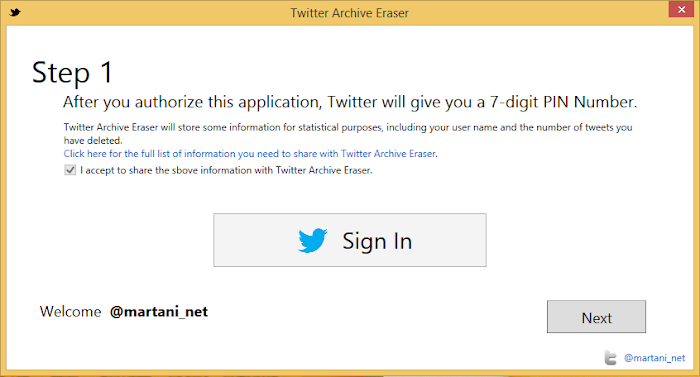
Step 1
In this step, you give Twitter Archive Eraser access to your twitter account so that it can delete the tweets you select. This works by providing a PIN number that twitter provides after the authentication.
Note: You need to accept sharing several statistics to use Twitter Archive Eraser.
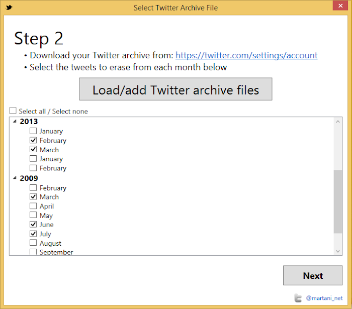
Step 2
After you download your Twitter archive (from https://twitter.com/settings/account) and you can load it directly as a zip file into Twitter Archive Eraser.
You can select which period of time you want to delete tweets from (grouped by month).
Step 3
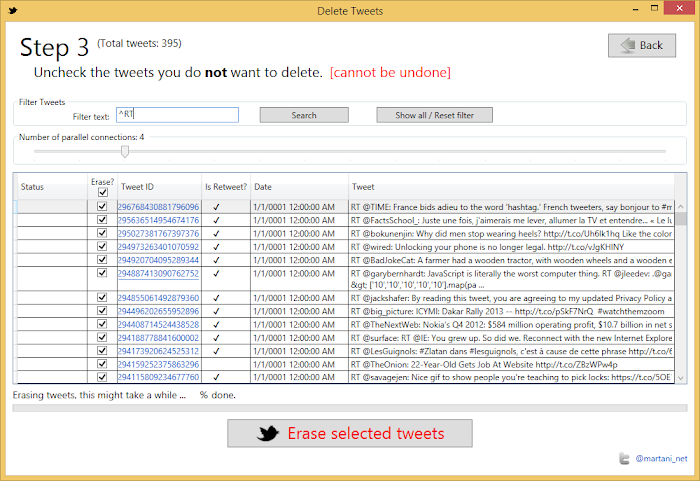
Once you have selected the months, you are now presented with all the tweets in this period of time. By default, all the tweets are marked for deletion, if you want to keep any specific tweets, just uncheck them as shown in the following picture.
You can use regular expressions to filter specific tweets to check/uncheck them (you can click the “Erase?” checkbox on top to check uncheck all the filtered tweets).
You can also choose the degree of parallelism you want: that is how many tweets Twitter Archive Eraser deletes at a time: the more the better. Notice however that this parameter is limited by your network speed.
You can pause/resume the deletion process and check/uncheck tweets in between.
Common filtering expressions
Use the following filtering expressions (without quotes “”) to search for:
Retweets: “^RT”
Replies: “^@\w+”
Reply to user martani_net: “^@martani_net”
Mentions: “@\w+”
Mentions of user martnai_net: “@martani_net” This will possibly return Retweets also
Tweets containing a number with 4 digits or more: “\d{4}”
Sadly, this app works only with Windows OS and yet developer is not further planning to develop this app for any other OS like Mac or linux. But don’t worry you can use apps like VMware or VirtualBox to switch to Windows and use the Windows apps.
Video explaining how to use “Twitter Archive Eraser”
All over the internet there are thousands of blogs devoted to fashion, beauty, lifestyle and everything in between. The message is clear — there’s never been a better time to be a blogger.
But what makes a blog stand out from the pack? We have the inside scoop to help take your blog to the next level, from the people who know the best — other bloggers.
Be consistent. A posting schedule will help your readers know when to check your blog. More than half of bloggers [surveyed] post on a weekly basis, 10.3 hours per week average time spent blogging.
Choose quality over quantity
One post you’re passionate about is worth a dozen that don’t matter. Your content is the heart of what you do so take the time to make it special — even simple ideas can be memorable when you add your own perspective. Remember: inspiration is everywhere when you know where to look. In the world of blogging 64% are inspired by daily life, 16% are inspired by magazines/websites and 20% are inspired by seasonal trends.
Create don’t curate
Instead of just reviewing a new trend, show how you would wear it. Putting your own spin on something can help your content stand out — especially when other blogger cover the same thing.
Keep a journal of ideas
Inspiration can strike anywhere. Carry a notebook with you on the go to write down any ideas that come to you — perfect for dry spells!
Visuals bring your blog to life
Use pictures to help tell your story. Got a smartphone? 60% of bloggers use their smartphone cameras to take photos.
Taking great pictures is not all about fancy equipment. Smart editing, thoughtful composition and good old fashioned daylight can help make your photos look more professional when you’re first starting out.
Build a community
Getting to know your readers and other like-minded bloggers will help your blog start to grow.
Don’t be afraid to put yourself out there — connecting with others makes the process all the more rewarding.
Best social network to connect with blog readers..... Twitter 43%, Facebook 30%, Instagram 23% and Google+ 3%.
Host a giveway
A fun way to drum up interest or thank your readers is by hosting a giveaway of some of your favourite things.
Ask for opinions
Chances are your readers are just as savvy as you are. Why not let them help you decide how to wear a trend or offer ideas for new posts?
Plan a meet up
A causal meet up is a great to meet readers and other bloggers. Plan something around an industry event or better yet, host a picnic in the park!
Based on an independent survey of fashion, beauty and lifestyle bloggers.
One of the best ways to set up a professional looking blog is through the use of WordPress. The hosting of WordPress is essentially a great platform for publishing which is chosen through the most of people because it provides a publishing knowledge that is satisfying, interesting, and simple. It is mainly frequently utilized as an application of blog publishing that is powered via PHP and MySQL. Appropriate to its user responsive benefits, WordPress has developed into very well liked with webmasters and bloggers. Nowadays, it is the very popular System for the Content Management (CMS).
To get started with a WordPress website, you will need a domain name and a web hosting service first. After those are set up, there are various guides that can take you through the process of getting WordPress set up through your hosting service. The most important aspect of using WordPress is finding the right hosting service. Here are some things to keep in mind as you seek the best one for your website.
The first thing you should be thinking about is the uptime. More uptime means that more people are able to view your website, increasing your popularity or making you more money if that is your main goal. Most cheap web hosting services offer poor uptime, and your website can even be down for extended periods of time. This spells out certain death in the online world, and you want to prevent this from happening at all costs. Look for hosting services that offer at least 99% uptime, and 100% uptime if you can find one that offers it.
Next, you want to ensure that the hosting service is compatible with WordPress, because not all of them are. It is one of the largest platforms for blogging in the world, but it requires a lot of memory to operate efficiently. Make sure you ask if it is supported before you choose to go with a certain service.
Try to find a server that offers live chat support for any issues you may have. WordPress is very prone to bad script and frequent downtime, so a server with live chat support will be able to give you the quickest answers and get you back up and running again in no time.
Buying a Facts When Choosing WordPress Hosting
Typically, people who create blogs and straightforward websites are not very familiar with the technical elements of running an internet site .. Consequently, these persons are more inclined to start using a CMS or website CMS in order to maintain their internet presence. WordPress can be a first-rate CMS platform. It can be database-driven and includes a large range of extensions, plugins, and internet applications. It is also exceptionally interactive and provides for customization which responds to client requirements for example domain specs, bandwidth needs, and privacy and security.
Given it has numerous uncomplicated functions, WordPress makes making a web or blogsite so much easier for your one that isn’t a web expert. With countless exciting improvements, a WordPress product demands hosting which is powerful and dependable. It takes exactly the best, top-notch WordPress hosting. Accordingly, a hosting arrangement with WordPress is ideal for anyone that desires to run a blog or website with no worries. To ensure you hold the best hosting for your WordPress site, there are many stuff you should know.
Precisely What are Your Preferences?
Before you even begin to consider hosting with WordPress, you have to know what your hosting requirements are. In case you are unsure regarding your own personal technical needs, it’s going to be most challenging that you should find out the best host. Some of the aspects of concern range from the quantity of bandwidth your internet site will require, the available storage room, the server specifications, and the average yearly downtime. These are just some of the requirements that might affect the selection of WordPress hosting. When you have designed a thorough report on all of your needs, then you can certainly begin the quest for your ideal host.
Would be the Newest Versions of WordPress On the market?
In an ideal world, the WordPress service provider you choose is going to be providing you the latest versions of WordPress. In the world of software, the modern versions are always better simply because they contain product enrichments which enhance faults, strengthen old features, and release new tools. As such, the WordPress upgrades make sure your web or blogsite is definitely capable of at its peak general performance while remaining appealing.
Have You Tested the Hosting Reviews?
Reviews are getting to be extremely important within the everyday life of all people. They normally use these phones decide what cars to acquire and what places to visit. These days where it seems like like you will find there’s new web hosting service sprouting up every 5 minutes, comments are crucial in distinguishing between those that are sub-par the ones which exceed expectations. Familiarizing yourself with hosting reviews could make it much easier that you should get the WordPress hosting service that may meet all your requirements.
Don’t Neglect the Attributes of Hosting with WordPress
The most important benefit of hosting with WordPress will be the convenience you obtain from knowing your blog or website is protected and fully functioning twenty-four hours per day, seven days a week. Because WordPress hosting works along with cloud servers, you’ll always have speedy use of your sites. Just as importantly, the gigantic storage space you are allotted with this particular hosting ensures you can store the maximum amount of content and knowledge as you wish.
There has never been an issue as to whether or otherwise not you should host your site with WordPress. Hardly any other hosting will be as uncomplicated and efficient simply because this CMS. In case you sleep better in the evening knowing your website is always accessible and working correctly, what you need to do might be select the best WordPress hosting.
Mostly, all the PC users are aware of the 32-bit (x86) and 64-bit (x64) operating system (OS) architecture versions of existence, but they hardly pay attention towards the difference between the two. Keeping the bigger-is-better philosophy aside, sometimes you might consider that which OS version you should actually install and how it will be affecting the performance of your PC? Some tech geeks may recommend that you should you use a 64-bit version of Windows, but here comes a big question — why? According to some researchers and PC experts, the 64-bit version is more efficient and rates higher on performance over than the less capable 32-bit version.
The terms 32-bit (x86) and 64-bit (x64) refer to the way a computer’s processor (also called a CPU), handles information. The 64-bit version of Windows handles large amounts of random access memory (RAM) more effectively than a 32-bit system.
In this article, you’ll read about various aspects of 32-bit (x86) and 64-bit (x64) versions of Windows with a conclusion to draw a clear picture about which one you should install and why?
How to check which OS architecture version do you have?
To check out that which version of Windows you are currently running on, all you need to do is reach the ‘System Properties’ in ‘Control Panel.’ You can also right-click on ‘My Computer’ icon, and choose ‘Properties’ from the drop-down menu. Always remember that in order to make your system run on a 64-bit OS version, your CPU must support the same. PCs running on a modern CPU should be fine, but some of the budget PCs don’t include/support for a 64-bit processor.
Do 32-bit PCs really have a memory limit?
Since the 32-bit operating system doesn’t support more than 4096 MB of RAM, the memory is limited to that value only. If you’re running on a 32-bit system, each running process will be given not more than 4 GB of virtual memory to play with, out of which 2 GB of user space is already fixed. Apart from this, your video card and motherboard BIOS will also take some place in that same 4 GB space, which makes your system slow and lagging. According to tech experts, the modern chips support PAE, a processor technology to permit OS to use a little bit more memory. But, it also requires special application support that needs to be installed on the system.
It’s a myth that only Windows-specific users will face this issue however, the fact is 32-bit Linux and Mac OS X users also have the same limitations and the same workarounds. To prove the same, experts tested the 32-bit Linux that comes with a facility of mapping table to access the extra memory. Apple’s OS X Snow Leopard is shipped with a 32-bit kernel, by default, and can’t access all the memory.
What’s different in 64-bit and why is it better?
Packed with super-performance features, a 64-bit OS version provides access to 17.2 billion GB of the system’s memory. This clearly means no matter how heavy your video cards and other devices will be, it will neither steal the usable memory space not it will impact the performance of the device. Windows 64-bit Home editions can only have up to 16 GB of RAM, but the Professional and Ultimate editions enjoy the liberty to use up to 192 GB of RAM.
Giving importance to the per-process limit, Windows 64-bit version has offered each application the ability to access up to 8 TB of virtual memory without adding any special API or installing any software. Therefore, users can easily choose this OS architecture version for performing various heavy tasks such as video editing, running heavy application with graphics, or creating systems into virtual machines.
Windows 64-bit versions are more secure and user-protected as they come with a technology that restricts hijacking the kernel, and provides support for data execution protection (hardware-enabled).
Do 32-bit applications work on 64-Bit?
Fortunately, you will find that all your 32-bit applications work just fine on 64-bit Windows version. Since, 64-bit version includes WoW64 compatibility layer, the entire system switches the processor back and forth between 32-bit and 64-bit modes to access the thread that requires to be executed. This back and forth switching of the processor makes a 32-bit software run smoothly on the 64-bit environment. Nothing comes without exceptions in this world and so does the OS architectural versions. The 32-bit device drivers and low-level system applications may not work without a 64-bit equivalent.
The verdict: Which one should you actually use?
If your budget is not a concern and you’re ordering a new PC with more than 4 GB of RAM, then you should go for a 64-bit version of Windows. Since the version supports a lot of features and performance enhancements, opting for 32-bit version will be a biggest mistake that you can ever make. Buying a 64-bit version will make you use all of the available memory and let you install large video cards and other devices without impacting the performance of the device. You should always remember that Windows Home editions can only support RAM up to 16 GB hence, if you wish to go for more then buy Professional or Ultimate Windows editions.
Our theories of sadness have evolved significantly over the past few thousand years. Ancient Greek doctors believed that sadness was a black liquid coursing through the body. In fact, the word “melancholy” stems from the words “melaina kole,” Greek for “black bile.”
Though scientists now know more about how our bodies process emotions, we still don’t know exactly why we feel sadness. In this TED-Ed lesson, Courtney Stephens examines the history of sadness and offers a few explanations for why it might be a more useful emotion than we’d expect.
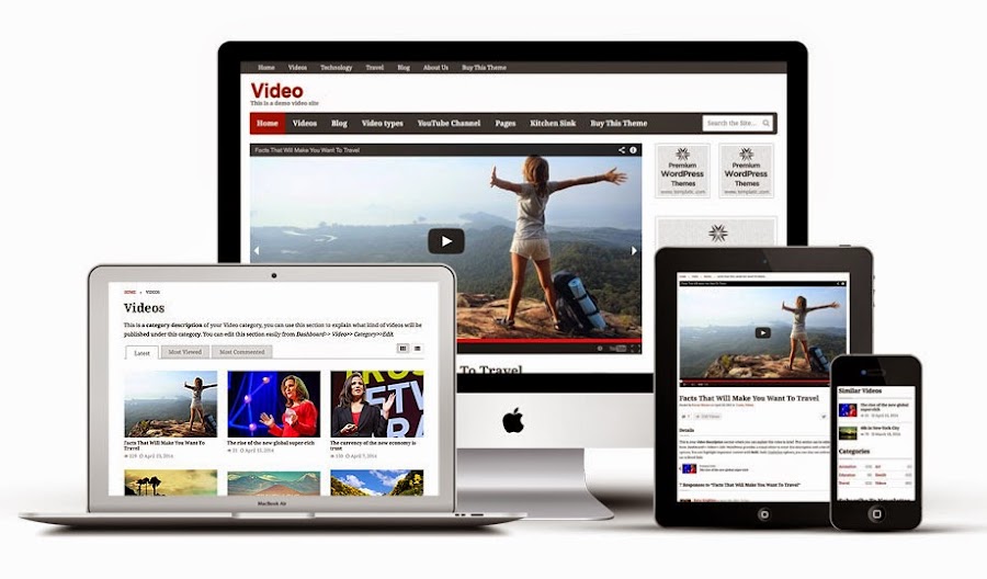
A proficient and compelling website is the frontal of your online business. Having a website for your business is best method for your users and visitors to find you. With a website, business owners can generate direct and viral traffic from visitors and customers who want to know more about their products and services. As having a good looking and professional website is necessary for your business, at the same time you need to be sure that your website is responsive too. Responsive web design is the primary source of ultimate success of your online business.
Responsive design: getting it right
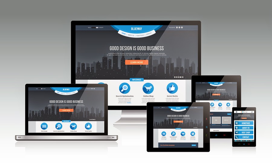
A website with a responsive web design is a website which is visible properly on all kind of mobile devices regardless of its screen size. In today’s tech era, when every day you wake up in the morning, you came to know about the new and latest trend in the web market, it becomes very challenging for every web developers and web designers to stay updated with those trends to survive in IT market with ease. One of the emerging and growing web trend in IT industry is the Responsive web design that is continuously gaining serious attention with the skyrocketing popularity of smartphones and tablets among large number of users especially youngsters and business owners.
In designer’s word, responsive web design is a specific type of web development and design that utilizes CSS3 with fluid proportion-based grids to adapt the layout of a design to viewing environment. Simply put this means that a website designer creates a site or a page that responds to the device a user is viewing the site on. So a user visiting a website on, say, their mobile phone, will see roughly the same website a person viewing from a PC or laptop. That said, more and more designers are changing the layouts so that instead of simply scaling up or down depending on what device you are using, you may see a different site completely from one device to another.
Every web designers and web developers has to take into attention the fact that users can now access internet anywhere and at any time. They are not limited to access internet from monitor or desktop only. So with the speedy and agile change from personal PCs to smartphones and tablets, it has become not only important but also necessary for any website page to resize itself in any screen shape. There has been a lot of buzz about the term ‘Responsive’. Responsive web design allow the visitors to navigate through different section of website from their handheld device with ease. Responsive web design is the concept that will let any website to embrace, resize and fit itself to cater for various screen sizes like desktop, smartphones, tablets etc., and also on the same time making sure that clients and customers can easily navigate your website.
Responsive web design will allow your target visitors to access your service and products you are offering to them from any king of device they have. Therefore we need to provide our users the best means of displaying the information on different screen sizes. Every business owner at the time of analyzing their web traffic will surely understand that about 50 percent of total web traffic to their business comes from small mobile devices. So, it becomes the single most important reason to give your website a responsive layout.
Responsive Web Design Trend
Web design encompasses many different skills and disciplines in the production and maintenance of websites. Areas of web design are graphic design (eg: logo, icons), interface (layout) design, proprietary software.
Responsive web design came about as a response to the growing popularity of portable Internet devices like mobile phones and tablets. An already fairly common and growing complaint from users of such devices was the “web’s” inability to adapt properly giving users a less-than favorable experience.
Now thanks to CSS3 and other developments users are able to enjoy their favorite websites and have access to their content on the go as well as at home. Websites are also able to serve their customers content where and when they need it, increasing ad revenue and traffic. In an increasingly mobile world you can expect to see more and more responsive web designs and, eventually, the difference between developing these and regular site will be no different.
Now let’s have a look on the several benefits of Responsive web design for your business.
Drive traffic to your business from all kind of users using desktop, personal computer or any kind of mobile devices. It will increase the total percent of your business traffic by mobile audiences.
Responsive web design for your business allow you to manage the complete website with one set of links which will as a result will increase your website visibility in all major kind of search engines including Google, yahoo and Bing.
Improve in sales and conversion rates of your business — Responsive web design boost conversion rates which is the ultimate requirement of any kind of online business. Responsive Web design is also user and search engine friendly.
Save time and money which is required on mobile website development.
Responsive web design will attract more number of customers to your site and this will take your business to next level of success.
To make the responsive design for your business you need to choose a good and professional web design company that will promise to complete your project on time with reasonable budget.
The anatomy of a responsive site
This infographic features Responsive Web Design Best Practices for both web designers and web developers, including a brief history of responsive web design and some facts/figures on media consumption and mobile usage.
In this world where the use of mobile devices is outgrowing the use of desktops and laptops most of us need to make sure that our websites and web products work on most mobile devices. That is to say that we need to make our websites responsive. This video is a quick primer on how to make your website responsive.
This video is made by the talented faculty and instructors at Fresh Tilled Soil Labs where they teach and give people the practical hands on design and development core skills and expertise they’ll need in the future.


![Business Forecast 2020, How Digital Risk is the Way Forward [INFOGRAPHIC]](https://lh3.googleusercontent.com/blogger_img_proxy/AEn0k_u01_usCfM5xmYtyF8xvWgJQWl0vfqPUXE0Jgm2g82dn674kzwE5CLmmiQUvGPOnsyNvgXweSwDAxHan41XYiJhG1FmwNrI5jg0mYAe-IpvcGML4bN1WEfH45BCvqvS6j2T8VLKOK-cHt_99V8JgAg=s0-d)